

Product
L’Oréal Operations 4.0
Internal admin portal
Users
Internal L’Oréal
employees
Role
UI/UX
Design Apprentice
Duty
Figma component library & Screen redesigns
Context
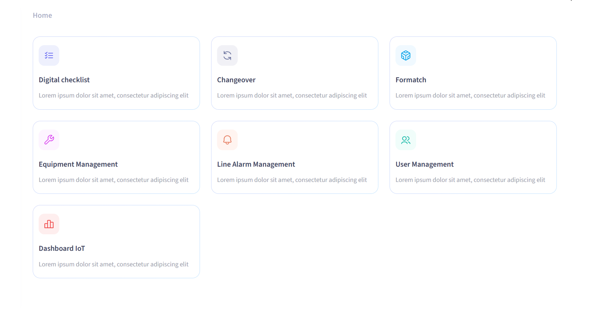
L’Oréal Operations 4.0 is an internal admin portal that gives employees access to web applications supporting manufacturing operations. It brings together a growing suite of 7 tools.
As features and applications were added, maintaining a consistent interface became increasingly difficult. The portal relied on an older implementation of the Carbon Design System, while the Figma library available to the team reflected a newer version. This created a gap between design and implementation: new features often required UI patterns to be recreated or manually customised to fit the existing product.
As the only UI/UX Design Apprentice in the Industry 4.0 Manufacturing team, I was tasked with creating a shared design foundation that could support the portal’s current needs while making it easier to evolve over time.
The result was the Industry 4.0 Design System: a scalable Figma library that establishes a refreshed and consistent visual language for the Operations 4.0 portal and its connected applications.
The Problem
Four challenges behind a fragmented experience
The portal had functional value, but its interface no longer provided a consistent or intuitive experience. During my review of the existing screens, I identified four main challenges.
Inconsistent component use
Existing components were not always used in the right context. Similar actions could look or behave differently across screens.
outdated visual identity
The portal was functional, but its visual language no longer reflected the team’s ambition for its Industry 4.0 tools. A refreshed identity was needed to create a more modern and recognisable experience.
Ambiguous user experience
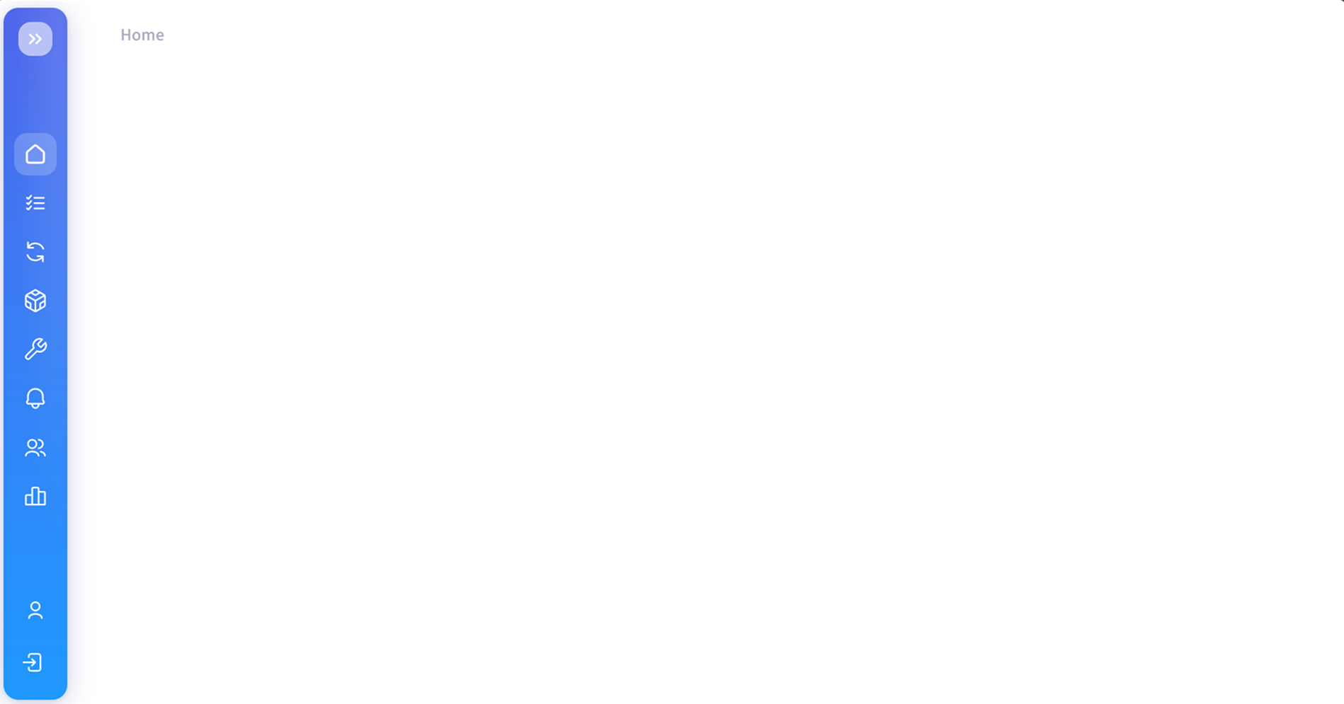
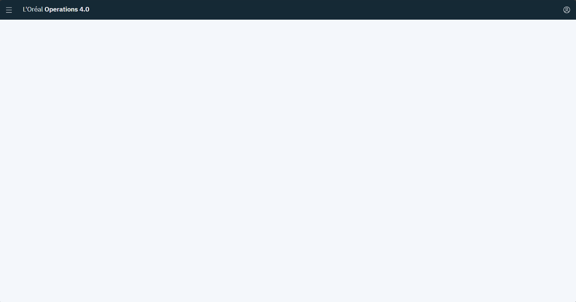
The empty home page gave new users no clear starting point. One user believed they did not have access because no content was visible.
Repeated effort for design & dev
Without a shared system, new features required repeated styling, layout and component decisions—slowing down both design and development.
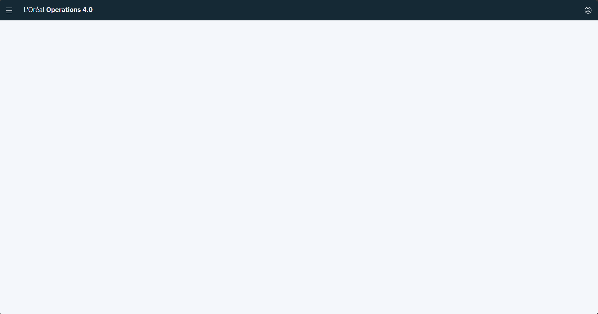
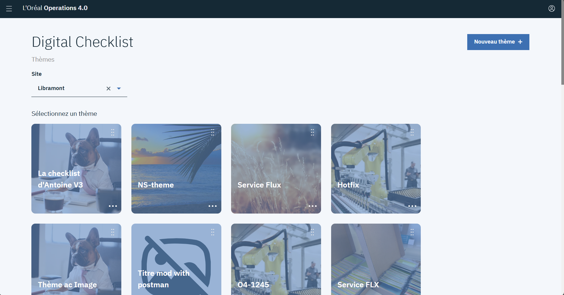
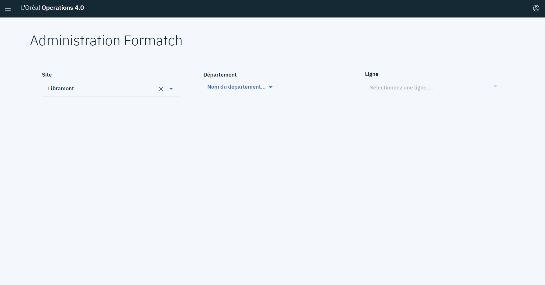
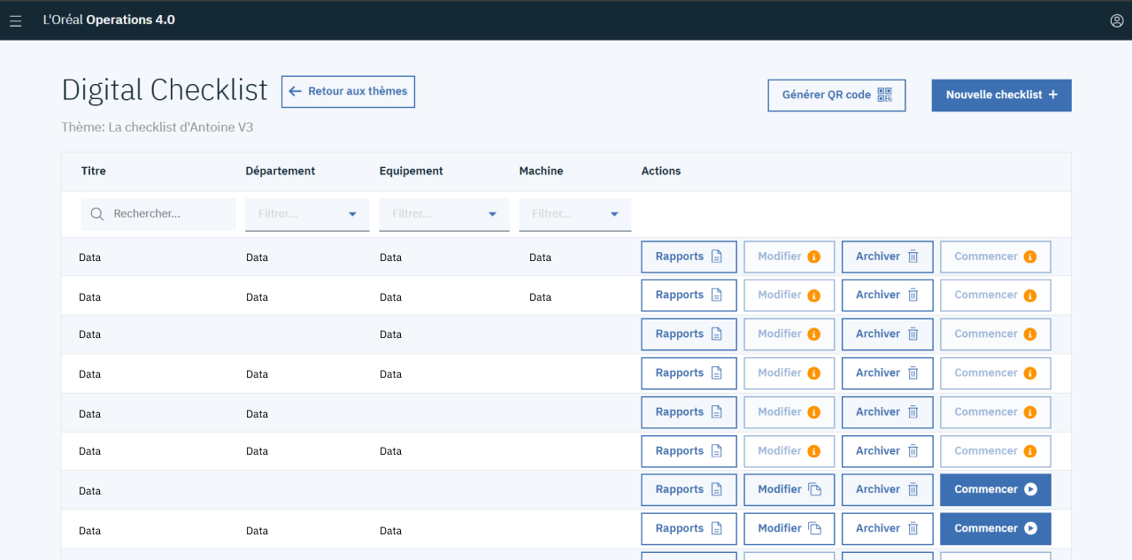
The UI review revealed inconsistent component usage, unclear interaction cues and patterns that made the portal harder to navigate with confidence.
How might we modernise the Operations 4.0 portal with a scalable design system that makes workflows clearer and easier to use?
To guide the work, four principles guided the design direction
CLEAR
Users should understand where they are, what they can do and what will happen next.
consistent
Similar interactions should look and behave in the same way across all applications.
scalable
New features and web applications should use existing patterns instead of introducing one-off UI.
Practical
The system should support workflows and make implementation easier for the team.
The Approach
The project followed a progressive transition from an existing interface to a more scalable product foundation. Rather than redesigning isolated screens first, the work focused on establishing the foundations and reusable patterns needed to support the portal over time.
Review existing screens
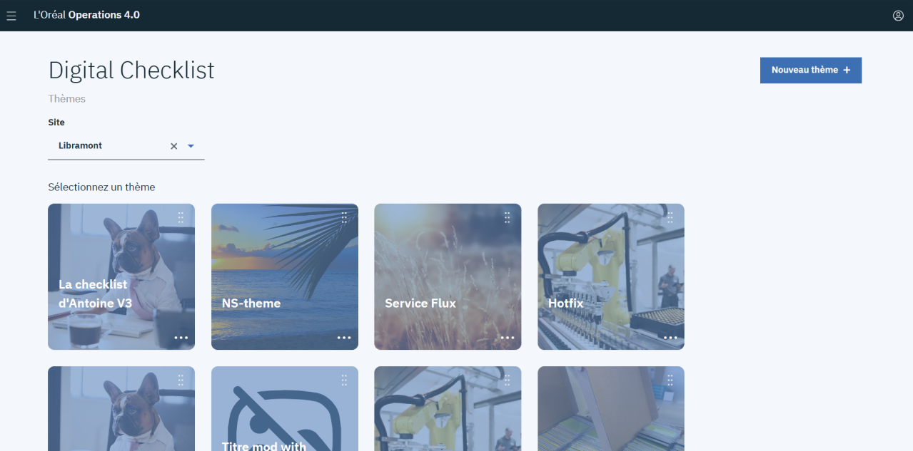
Existing portal and Digital Checklist screens were reviewed to identify recurring patterns, unclear interactions and opportunities for improvement.
Define the visual foundations
A new visual direction was established through colour, typography, spacing, shadows and semantic variables.
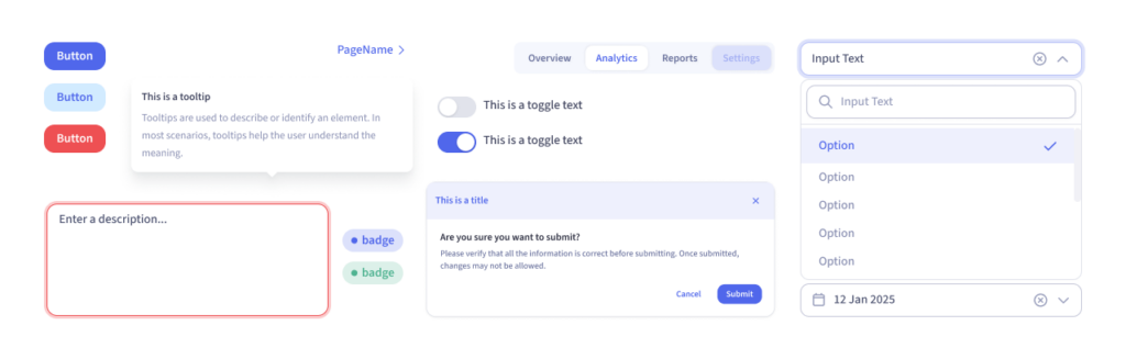
Build reusable components
Common interface patterns were translated into reusable Figma components, creating a consistent starting point for future features.
Apply the system to real workflows
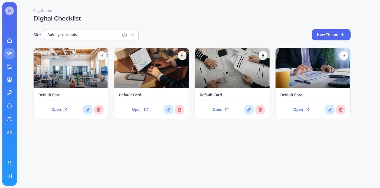
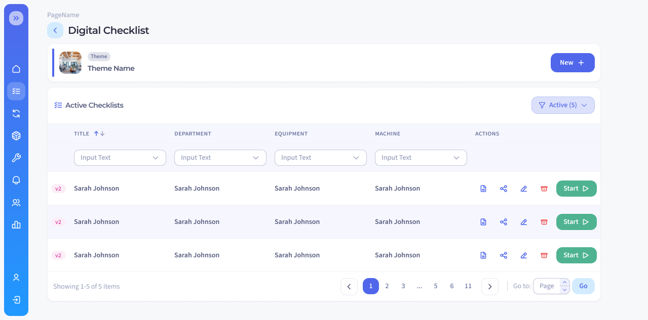
The system was applied to the Operations 4.0 home page and key Digital Checklist screens to demonstrate how the new foundations and components work in real product contexts.
Foundations
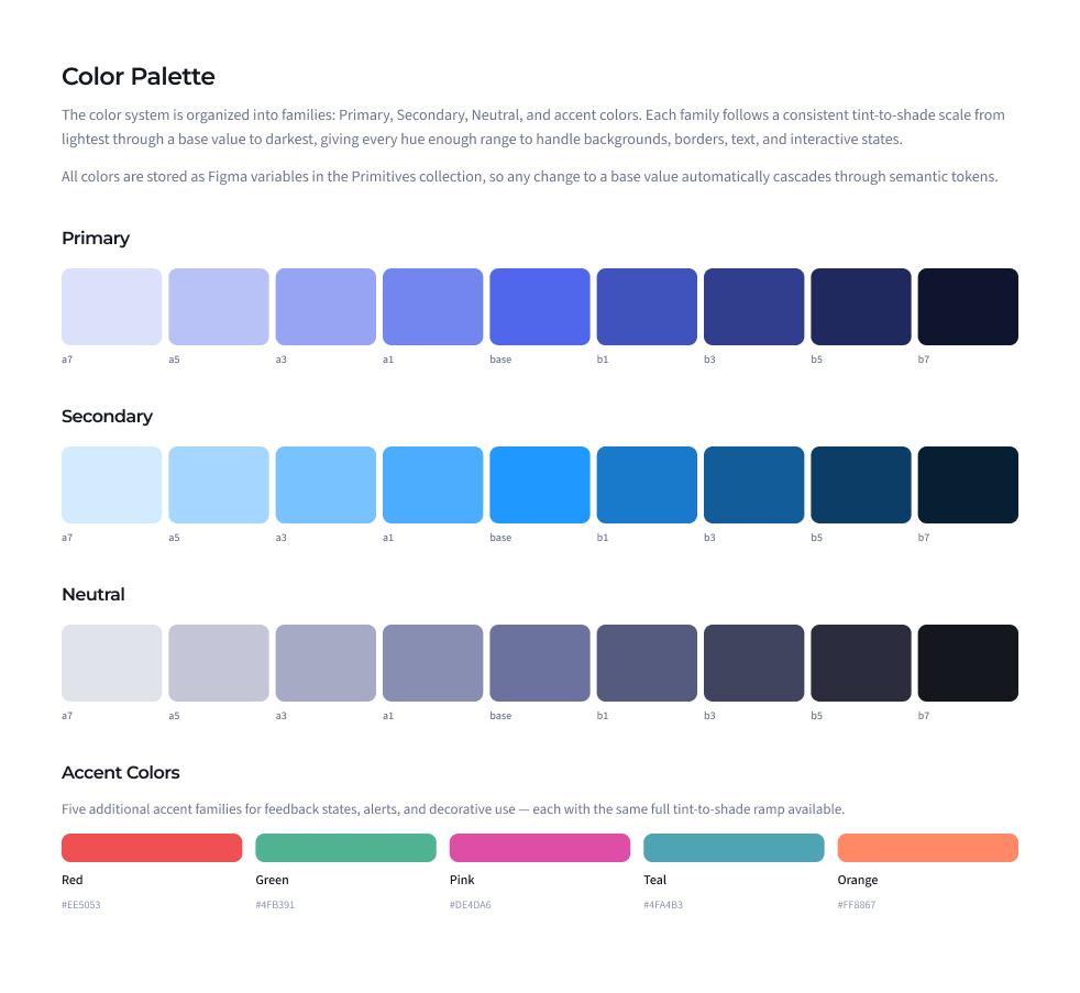
1. Color Palette:
The colour palette was informed by benchmarking digital products and drawing inspiration from L’Oréal Beauty Tech. It creates a refreshed Industry 4.0 identity while keeping actions and status information clear.
2. Typography:
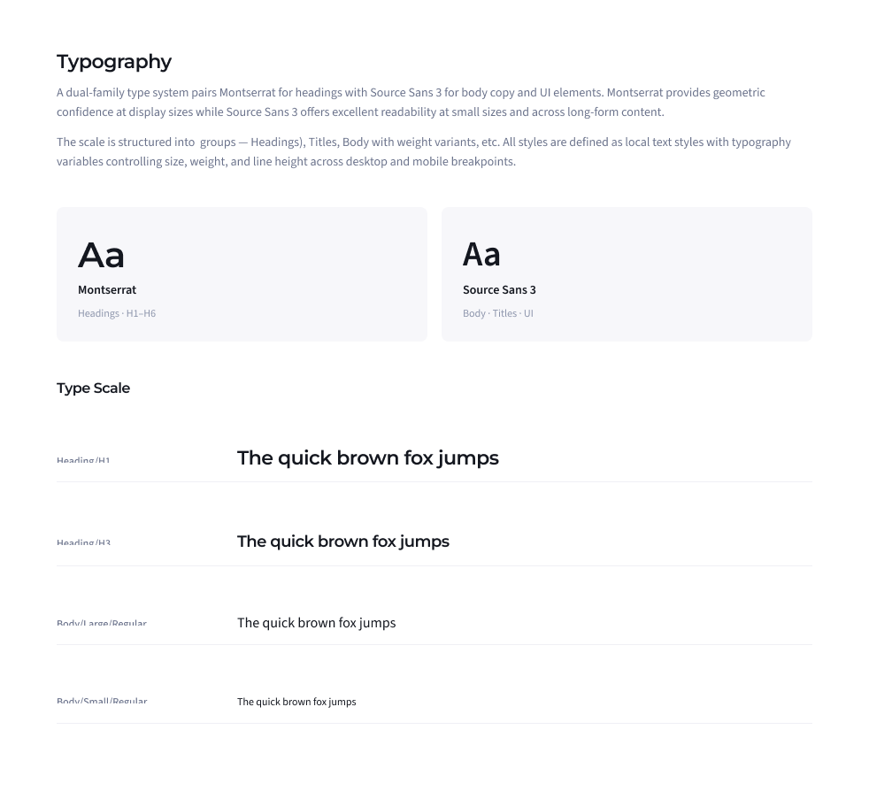
Several type variations were tested to balance the new visual direction with readability. The final scale was selected to remain clear across dense tables, filters and technical content.
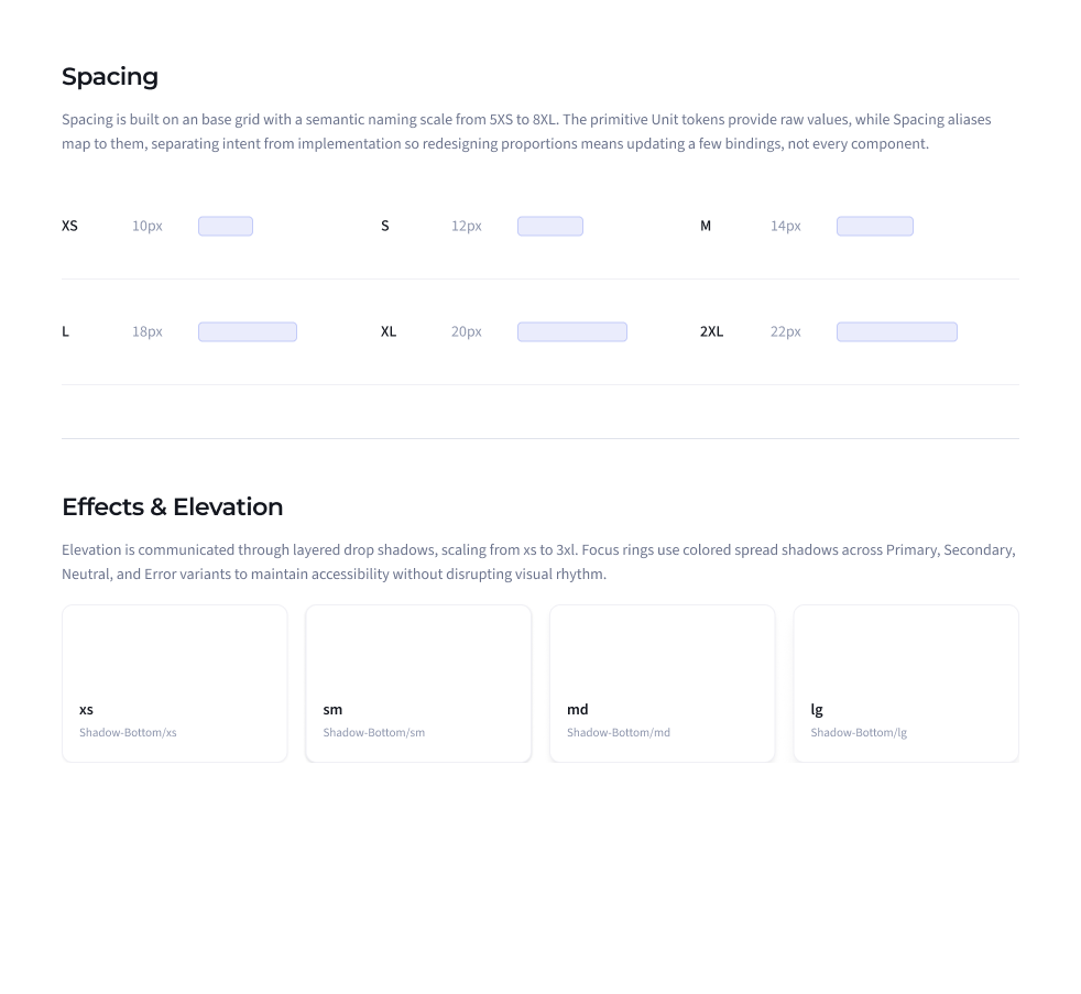
3. Spacing and elevation
A shared spacing scale, surface styles and elevation rules were defined to bring clearer structure and consistency to layouts. They help separate content and make dense screens easier to scan.
Figma Components
Configuration
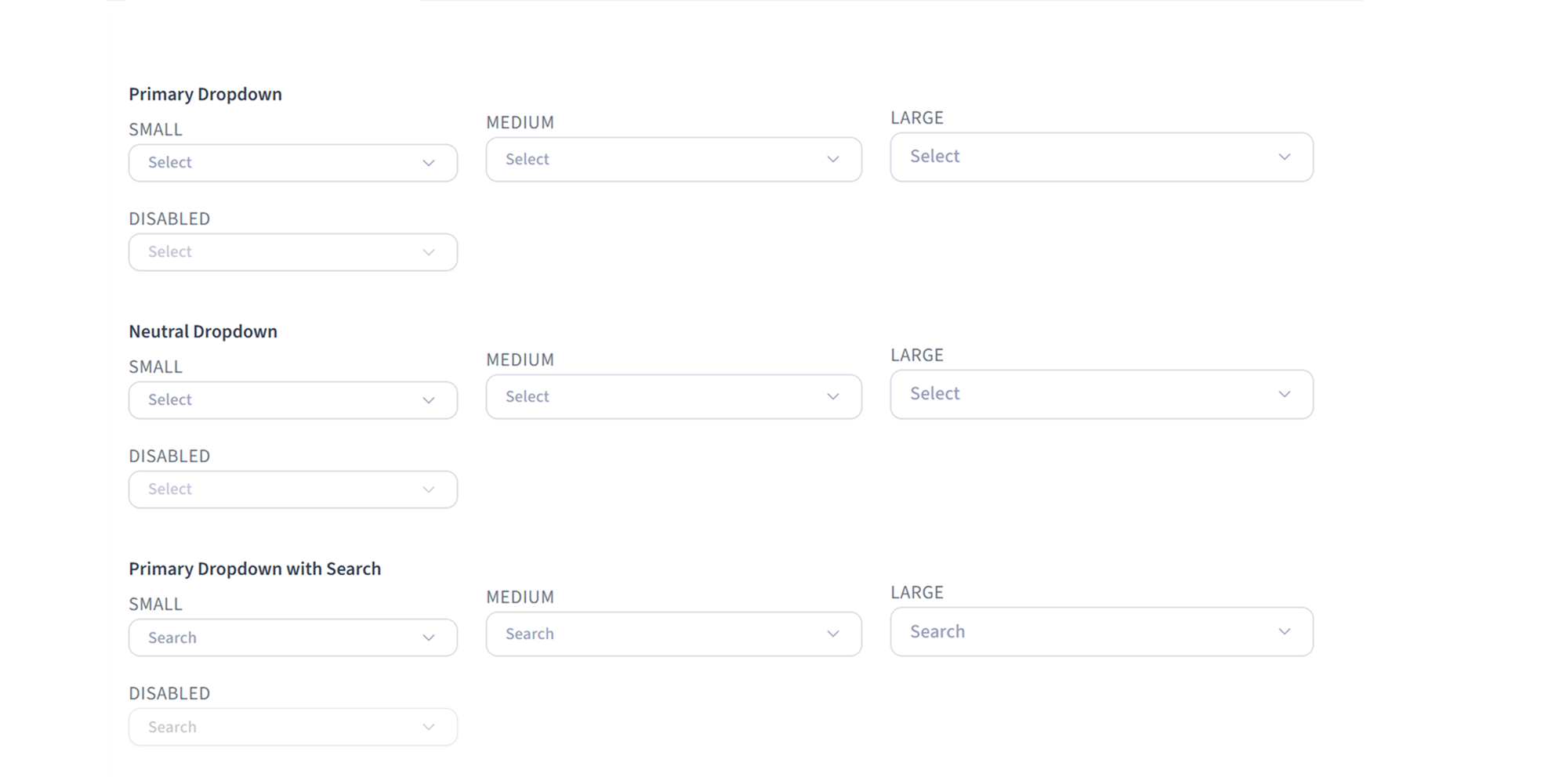
Components were structured with Figma variants, component properties and boolean variables to make common states easy to configure without rebuilding elements manually.
This allows designers to switch options such as icons, labels, states or supporting content directly from the properties panel, helping screens stay consistent while making design work faster
Progressive implementation
The system is progressively being implemented by the development team.
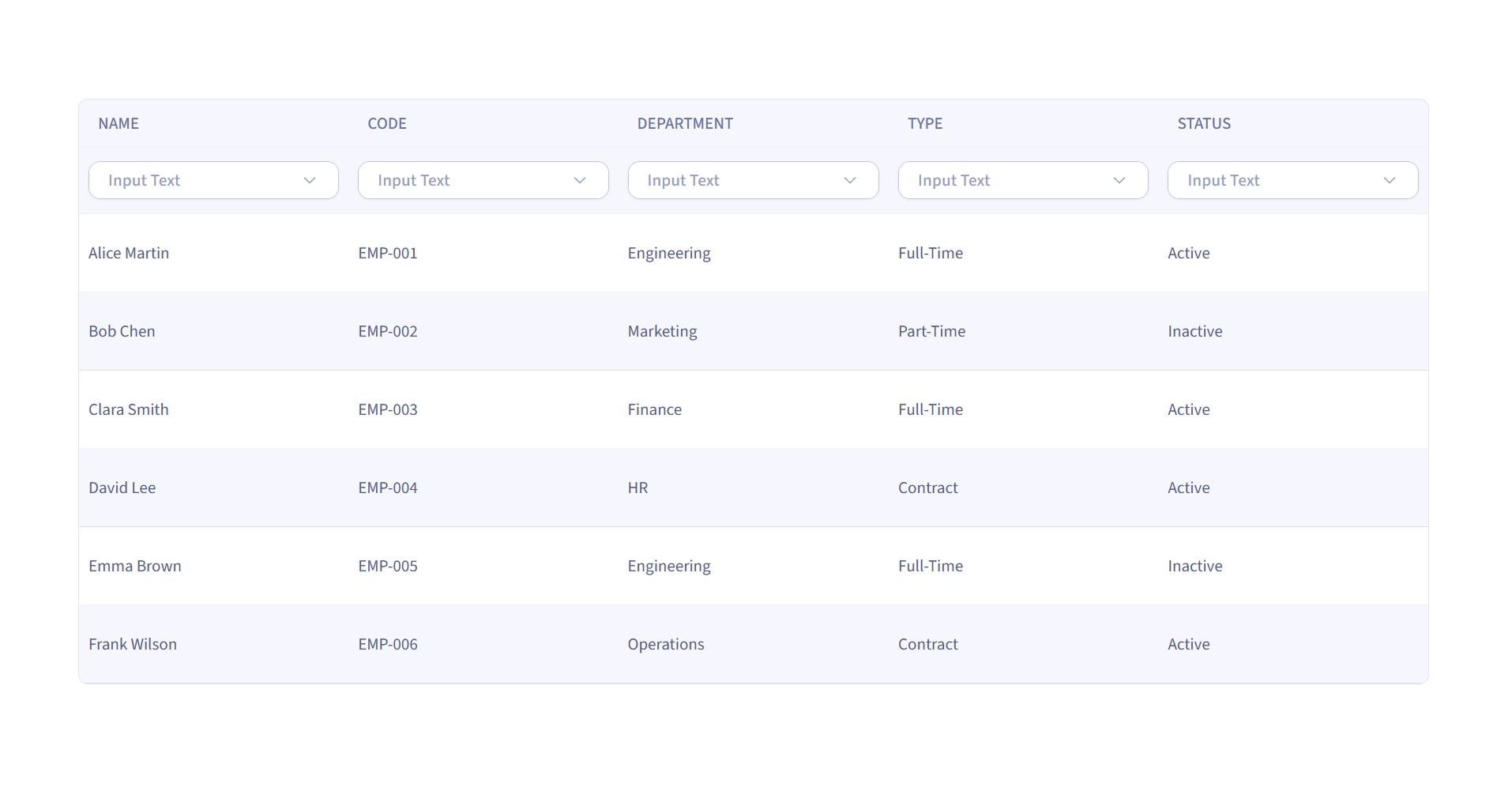
Core elements already in implementation include:
Buttons -
Header - Tables -
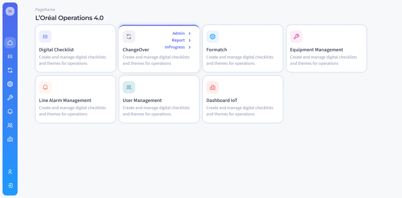
Home cards -
Dropdowns -
Breadcrumbs
This creates a practical path for gradually replacing legacy patterns while supporting new features
UI Design
Applying the system to real workflows
The new foundations, variables and components were applied to key Operations 4.0 screens to demonstrate how the system could improve real product experiences.
The redesign focused on creating clearer entry points, more consistent actions and easier-to-scan operational interfaces.
A Shared Foundation for Future Growth
The Industry 4.0 Design System provides a clearer visual foundation for the ongoing modernisation of L'Oréal Operations 4.0.
It supports a refreshed portal identity, reusable patterns for connected applications and a more efficient starting point for future features.
For Users
Clearer navigation, more predictable interactions and easier access to portal applications.
For the Product
A refreshed, recognisable visual identity across a growing suite of Industry 4.0 tools.
For the Team
Reusable Figma patterns that reduce repeated layout, styling and component decisions.
Feedback
“It is helping speed up execution because layout, spacing, and styling decisions are already defined, allowing us to focus more on implementation rather than back-and-forth discussions”
“having Figma designs available upfront definitely streamlined the development process.
Overall, it made the workflow smoother”
“Le nouveau design fait du bien 😊”
“The new design feels good 😊”
More Than a UI Library
The project demonstrates how a design system can become a shared product language. By connecting visual foundations, semantic variables, reusable components and real product screens, the Industry 4.0 Design System creates a practical framework for clearer interactions, more consistent experiences and future product growth.