- tatiana.a.barakat@gmail.com

Le Bon Coin is a popular French classifieds website where users can buy, sell, or rent a wide variety of items and services. It was launched in 2006 and has since become one of France’s most visited websites for second-hand items, real estate, jobs, and services.
Duty
Redesign
Proposal
Industry
online classifieds
and marketplace
Role
UI/UX
Designer
Enhancing the Rental Experience on Le Bon Coin
In the study case on Le Bon Coin, the focus was placed exclusively on the Rental category, aiming to improve the user experience for those seeking accommodation. By identifying key user needs and potential pain points in the current rental journey, solutions were developed to enhance navigation, increase transparency, and provide a comprehensive platform that streamlines the entire rental process from start to finish.
Process
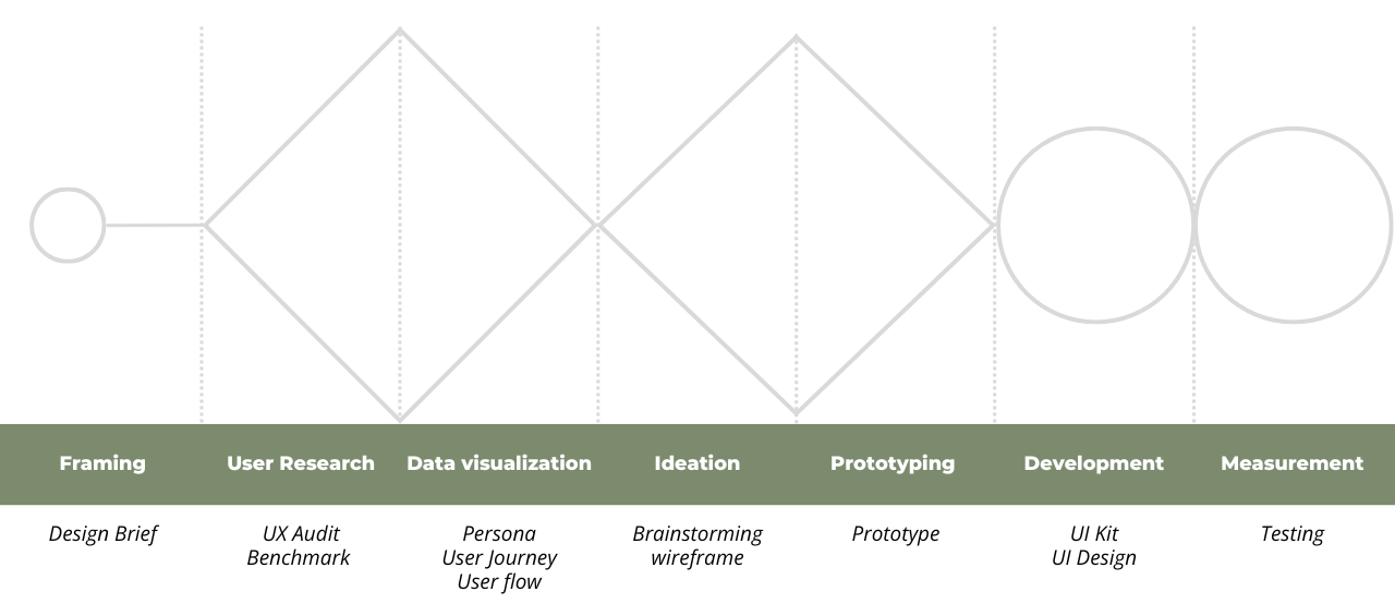
Double Diamond Process Model
Design Brief
Context
Le Bon Coin is a leading online marketplace in France, offering a wide range of products and services. The Rental category is a key segment for users searching for accommodations, including apartments, houses, and shared living spaces.
objective
Provide users with a secure, all-in-one platform to finalize their rental process, offering access to all necessary information, personalized guidance, and tailored suggestions to simplify and enhance their search experience.
audience
Primarily: Local and international university students looking to rent accommodation in France.
Secondarily: Anyone in need of rental housing, including young professionals, families, and expatriates.
Value
For Users: An all-in-one platform that simplifies the entire rental process, making it intuitive, secure, and efficient.
For Le Bon Coin: Greater user satisfaction and engagement, increasing user return rates.
For Landlords: Easy-to-use communication tools to connect with tenants and simplify the rental process.

How might we create an all-in-one platform that simplifies the rental process for users, making it intuitive, secure, and efficient, while ensuring a seamless experience from searching for accommodation to finalizing the rental, particularly for those moving to a new city?

UX Audit
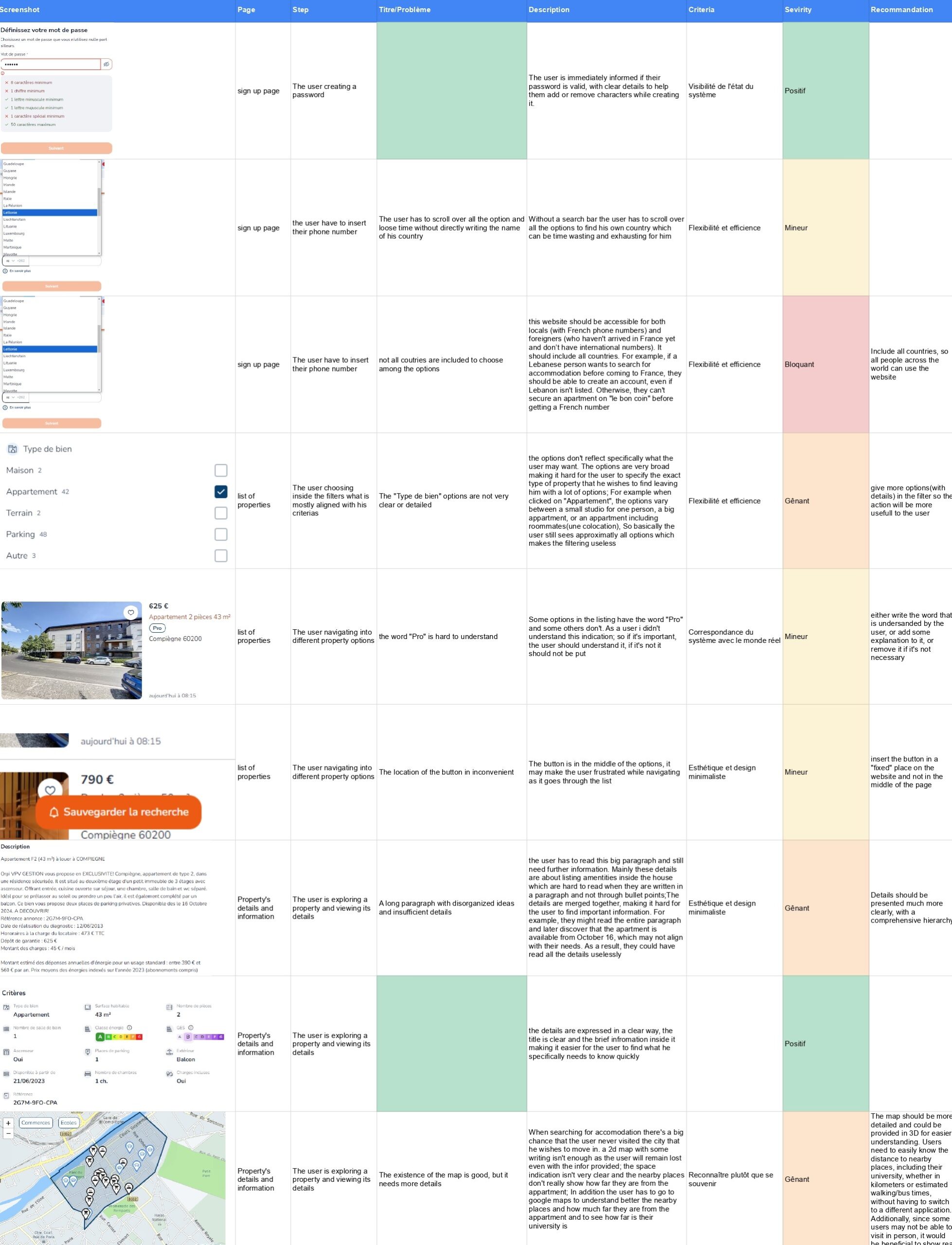
Identifying Usability Issues and Highlighting Strengths
The UX audit aimed to identify both positive aspects and pain points within the user experience. These findings were illustrated with screenshots, clearly highlighting the severity of each pain point. The issues were then analyzed in relation to Norman’s heuristics, evaluating their alignment with established usability principles. This approach helped pinpoint areas for improvement and prioritize design changes to enhance the overall user experience.
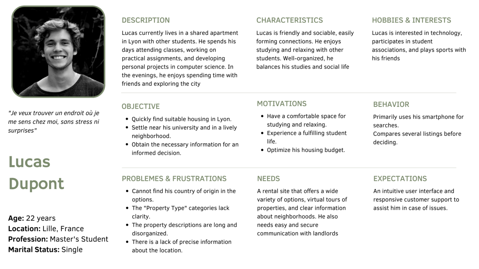
Persona
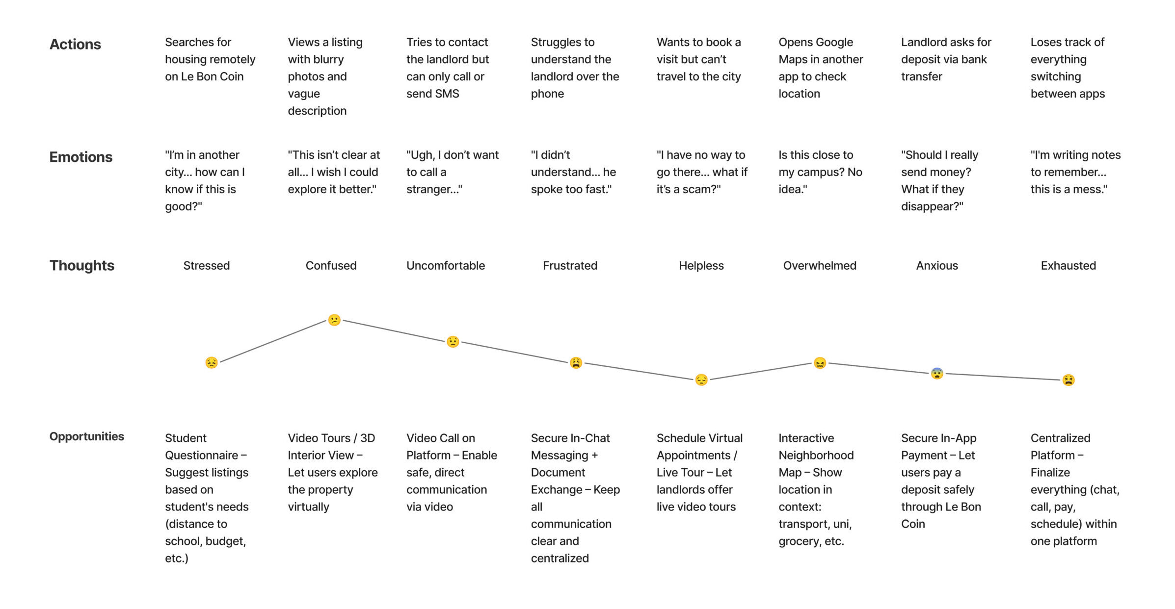
User journey
The user journey highlights Lucas’s challenges and objectives as he progresses through each phase, from start to finish.
User Flow
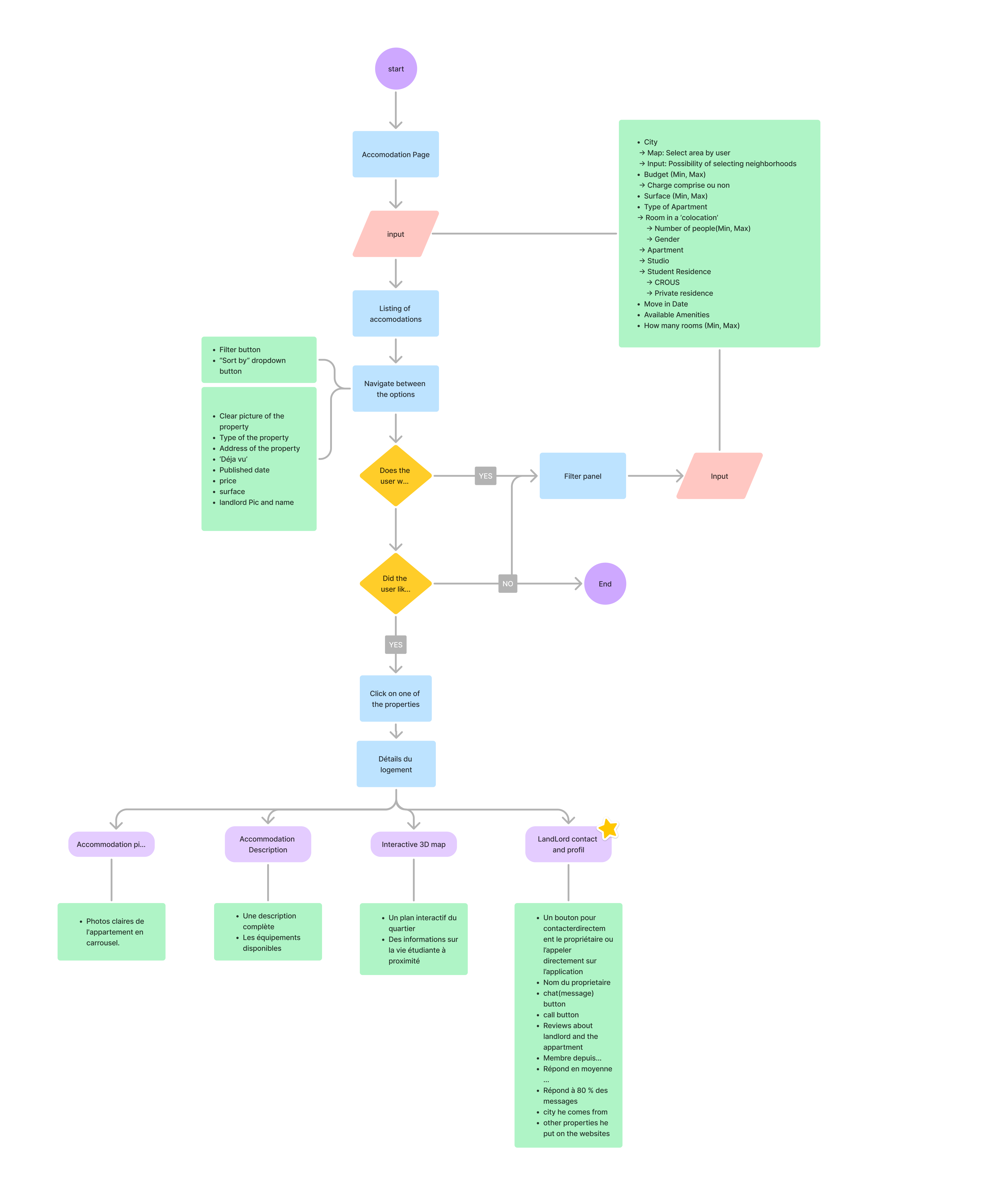
A user flow was created to map out the steps a user takes to achieve a specific goal within the application. The execution involved identifying key actions, decision points, and potential pathways users might follow. Each step was carefully considered to ensure clarity and smooth navigation
This is one of the user flows, showcasing the steps a user takes to complete a specific task within the website:
Brainstorming
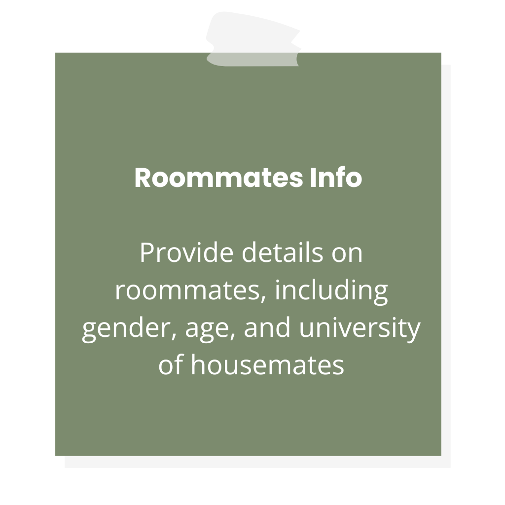
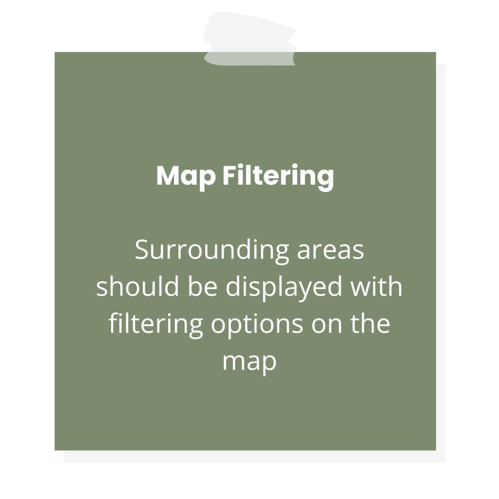
Enhancing User Experience for Property Rental
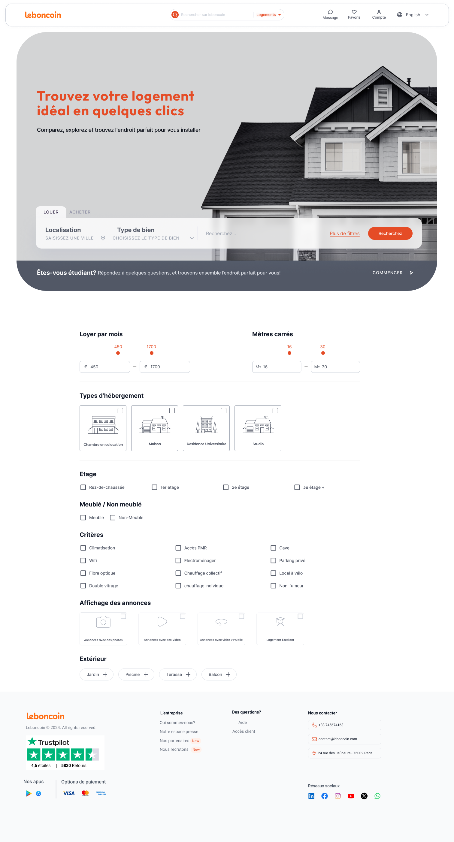
Three main themes of enhancement were identified. These focus on streamlining the rental process, enabling better exploration of properties for remote users, and offering personalized recommendations for students. The proposed solutions aim to make the platform more efficient, accessible, and tailored to user needs.
Finalize the Process on Le Bon Coin:
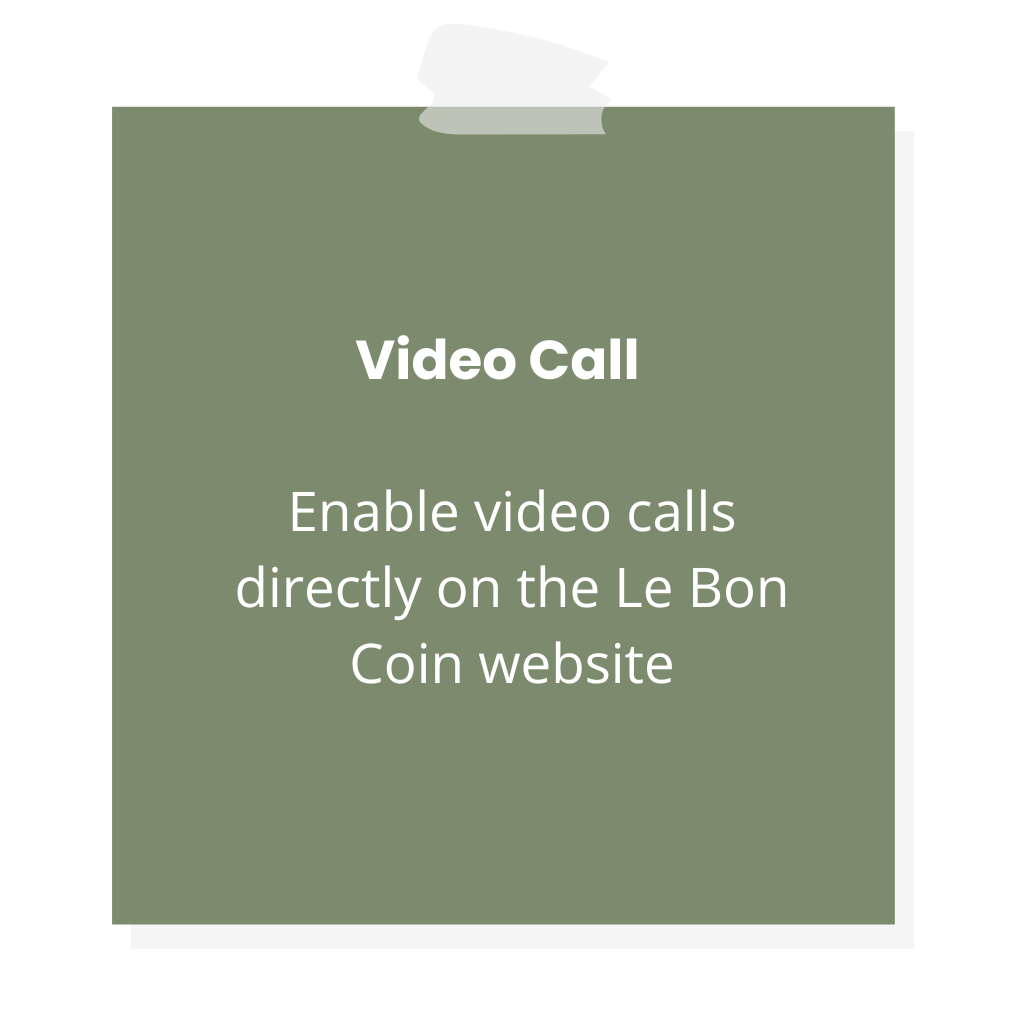
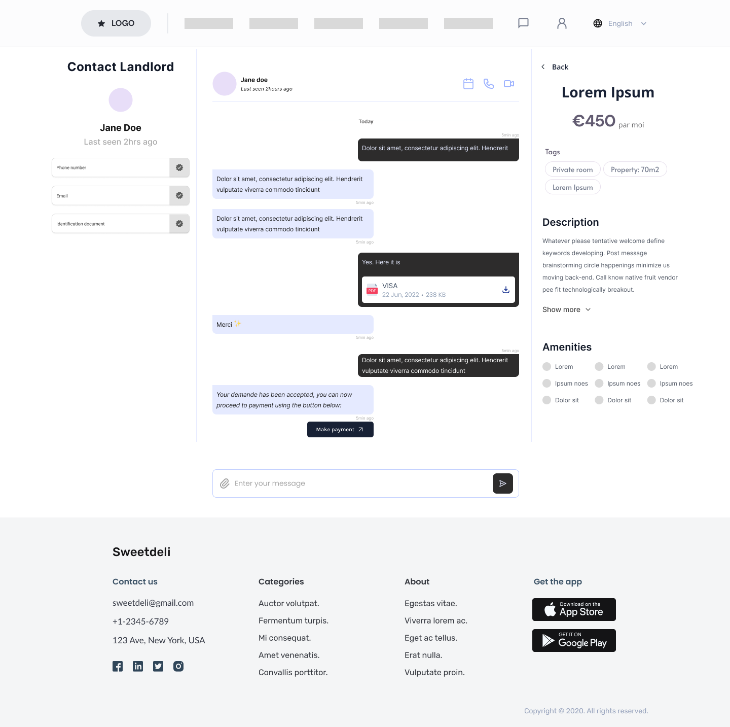
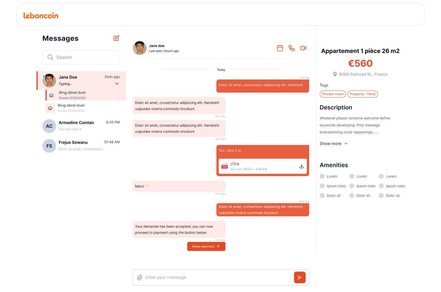
- Add Video Call Functionality: Allow users to conduct video calls with landlords on the website.
- Send Documents via Chat: Enable secure document exchange between users and landlords directly through the chat feature.
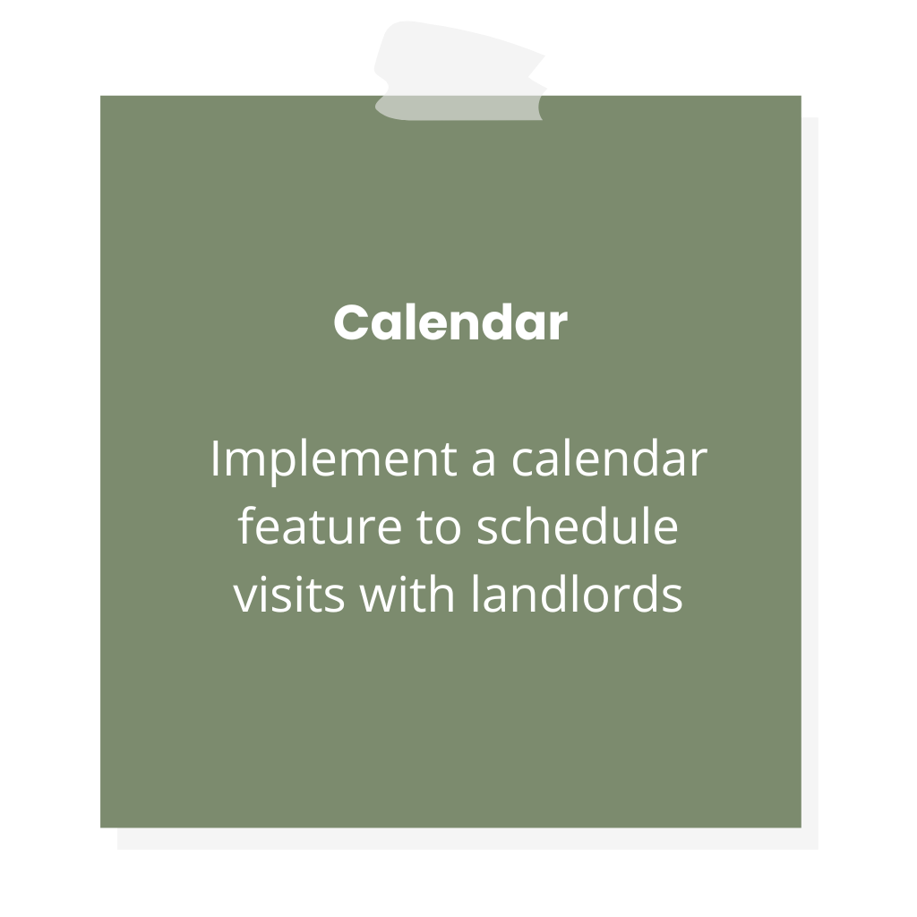
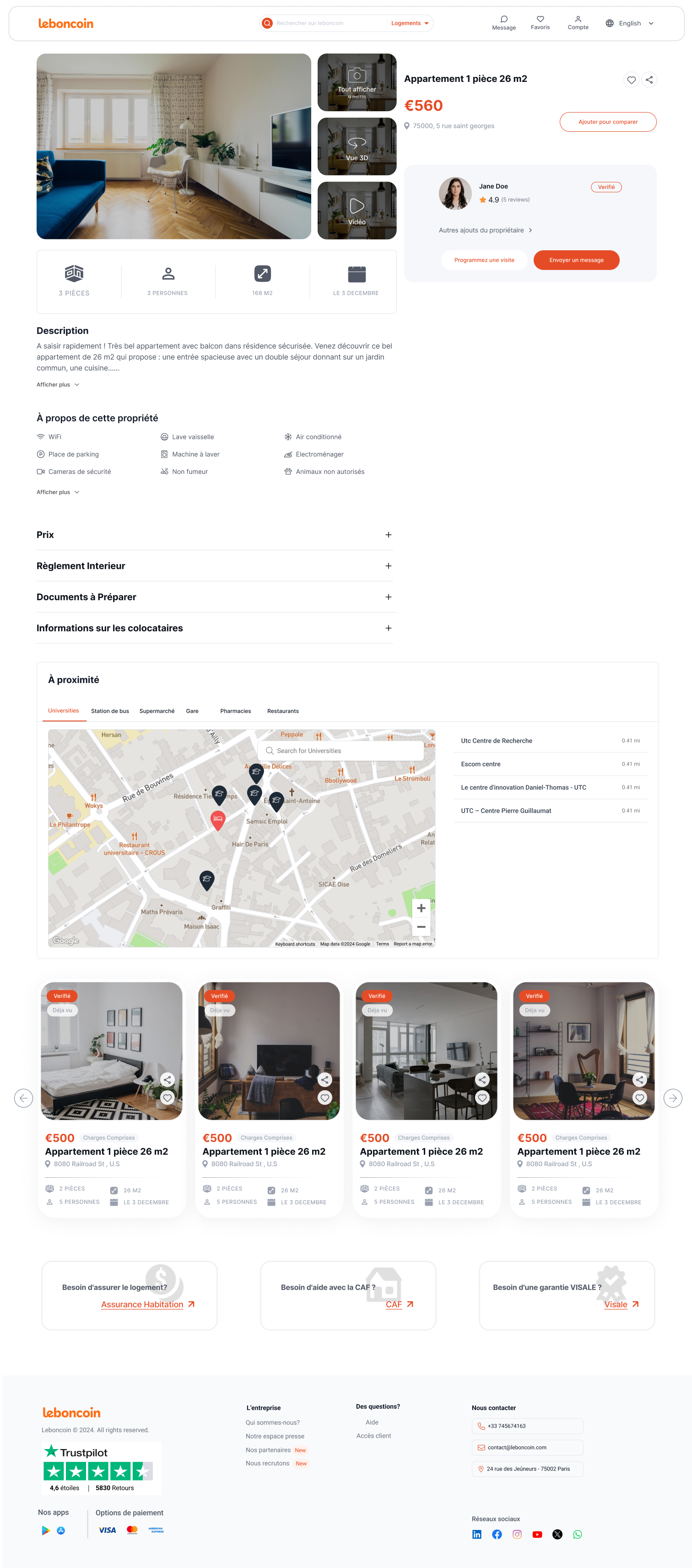
- Integrate a Calendar for Appointment Scheduling: Implement a calendar feature to schedule visits with landlords, ensuring a smooth and organized process for both parties.
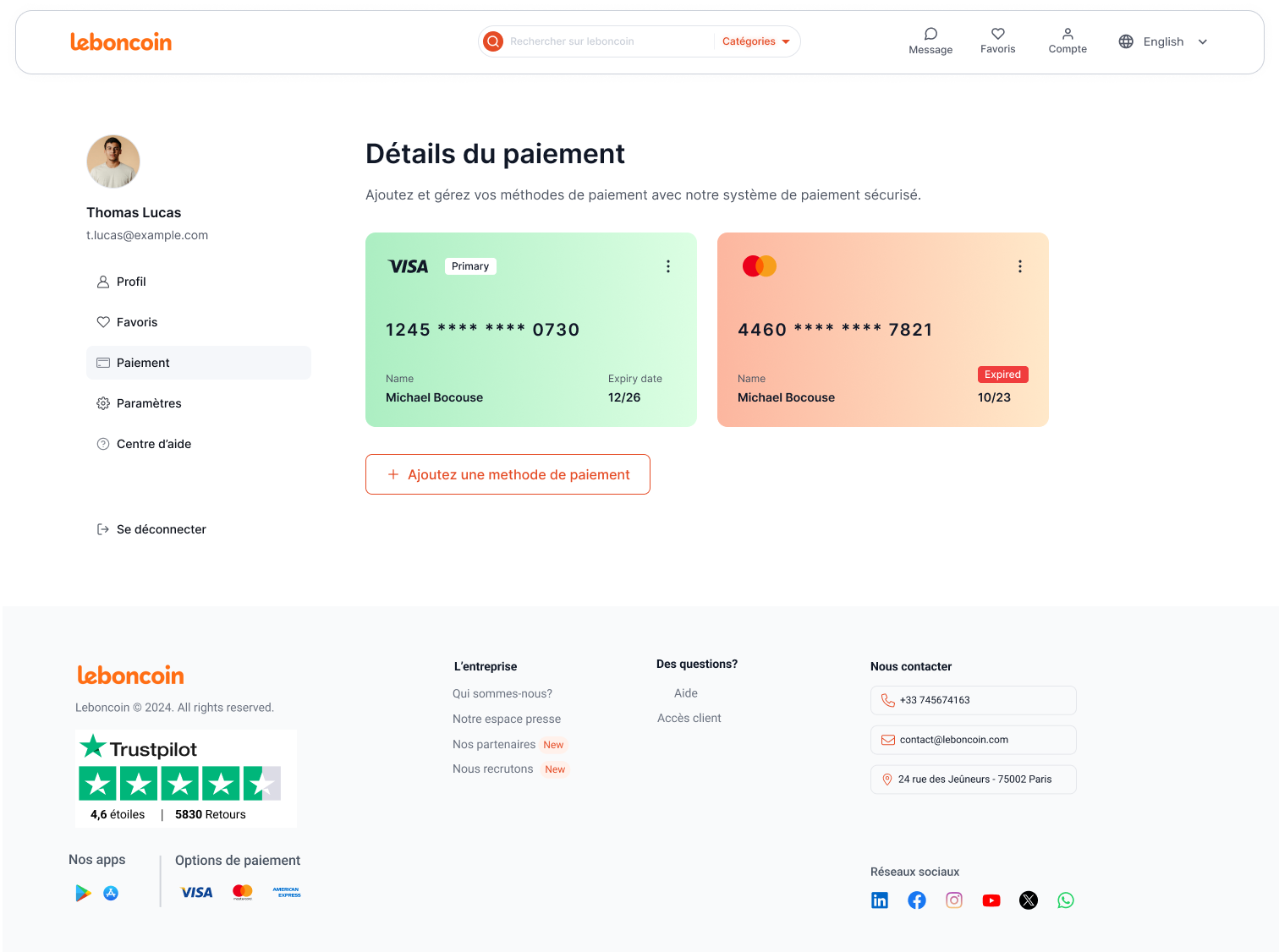
- Payment of Deposit: Allow users to securely pay a deposit through the platform to finalize the rental process and secure their preferred property.
Facilitate Exploration of Apartments:
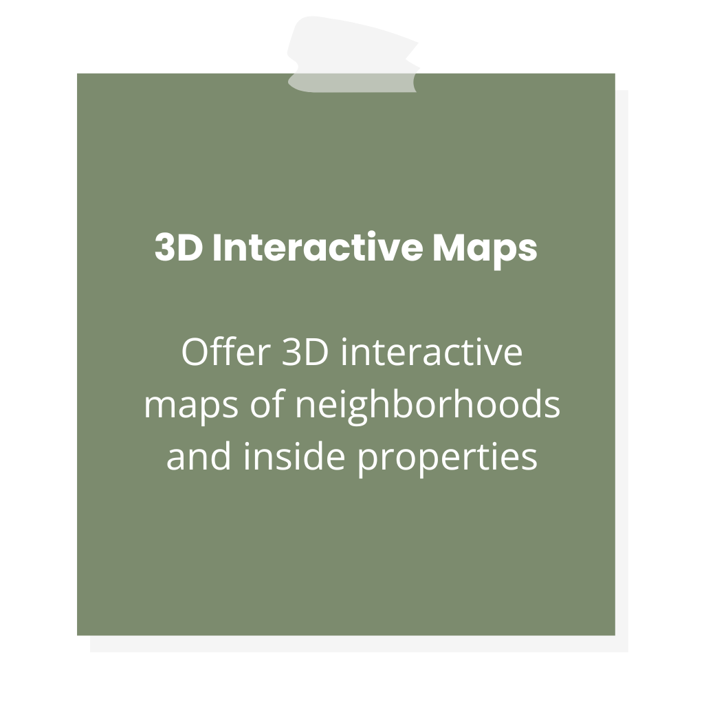
- 3D Map for Interior and Exterior Views: Provide a 3D map that enables users to explore the interior and exterior of the property virtually.
- Video Tours: Offer video tours of the property, giving users a real-time visual experience without needing to be physically present.
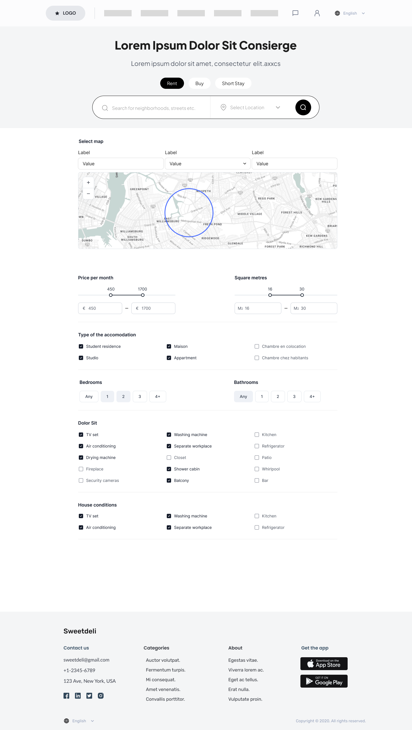
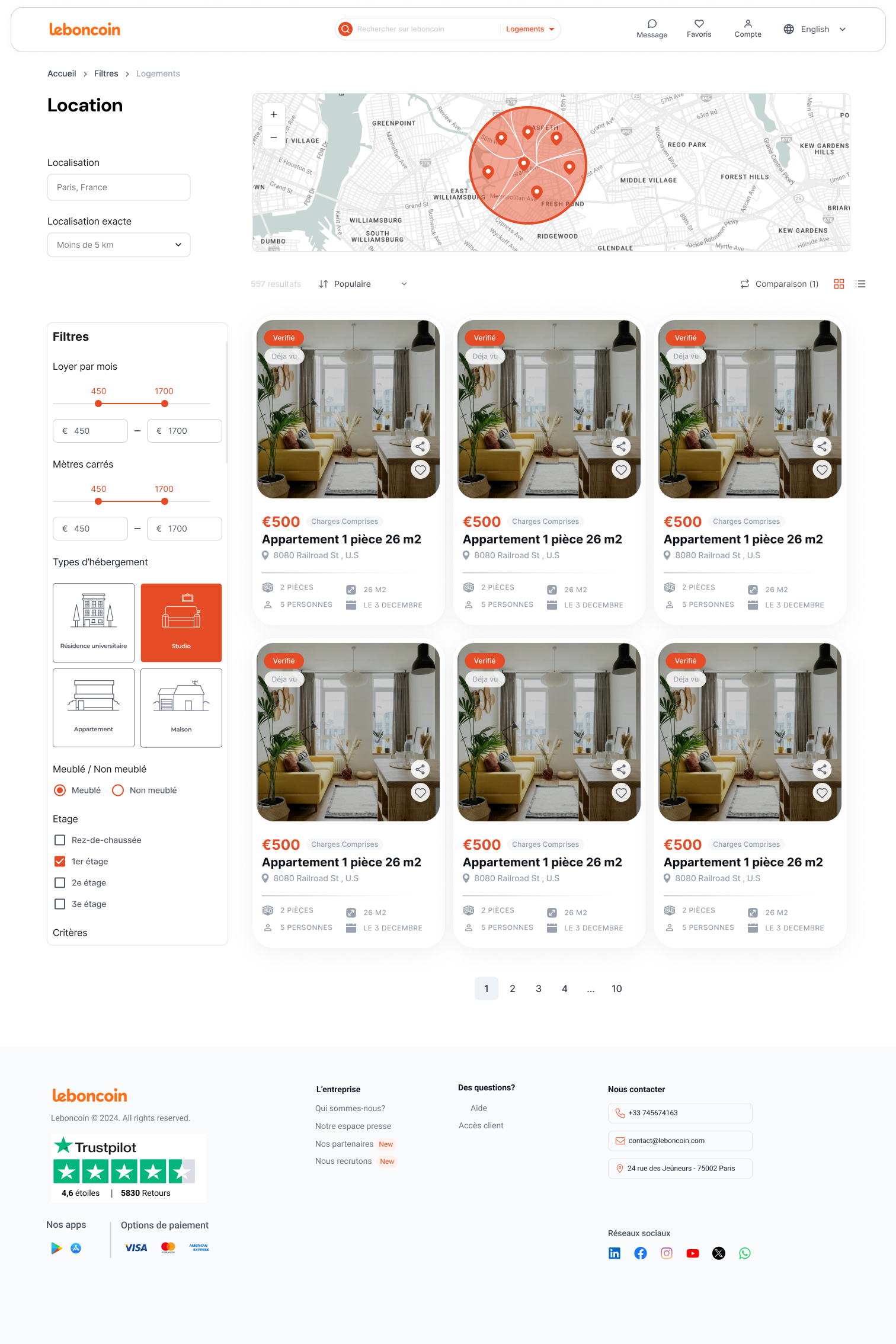
- Interactive Map to Explore the Neighborhood: Create an interactive map where users can view the property’s interior and gain insights into the surrounding neighborhood, helping them make informed decisions remotely.
Personalized Choices for Students:
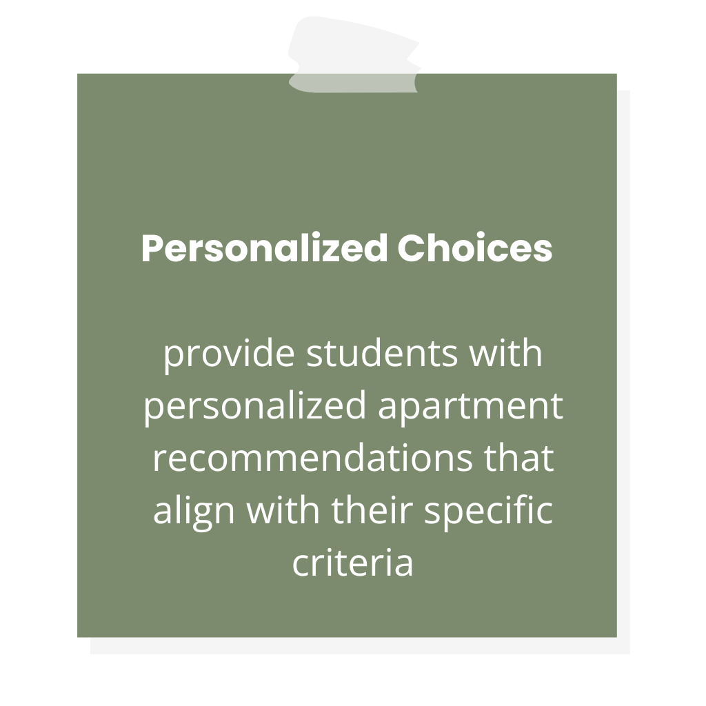
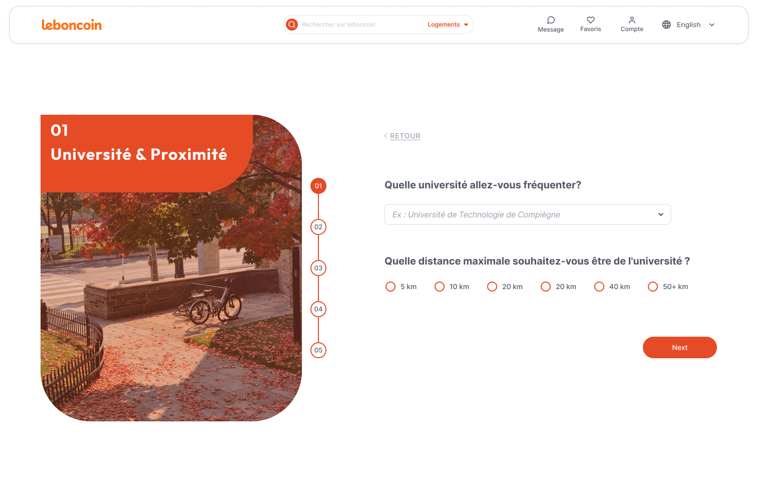
- Student Questionnaire: Ask students a few key questions to better understand their needs, helping to match them with apartments that meet their specific criteria and preferences.
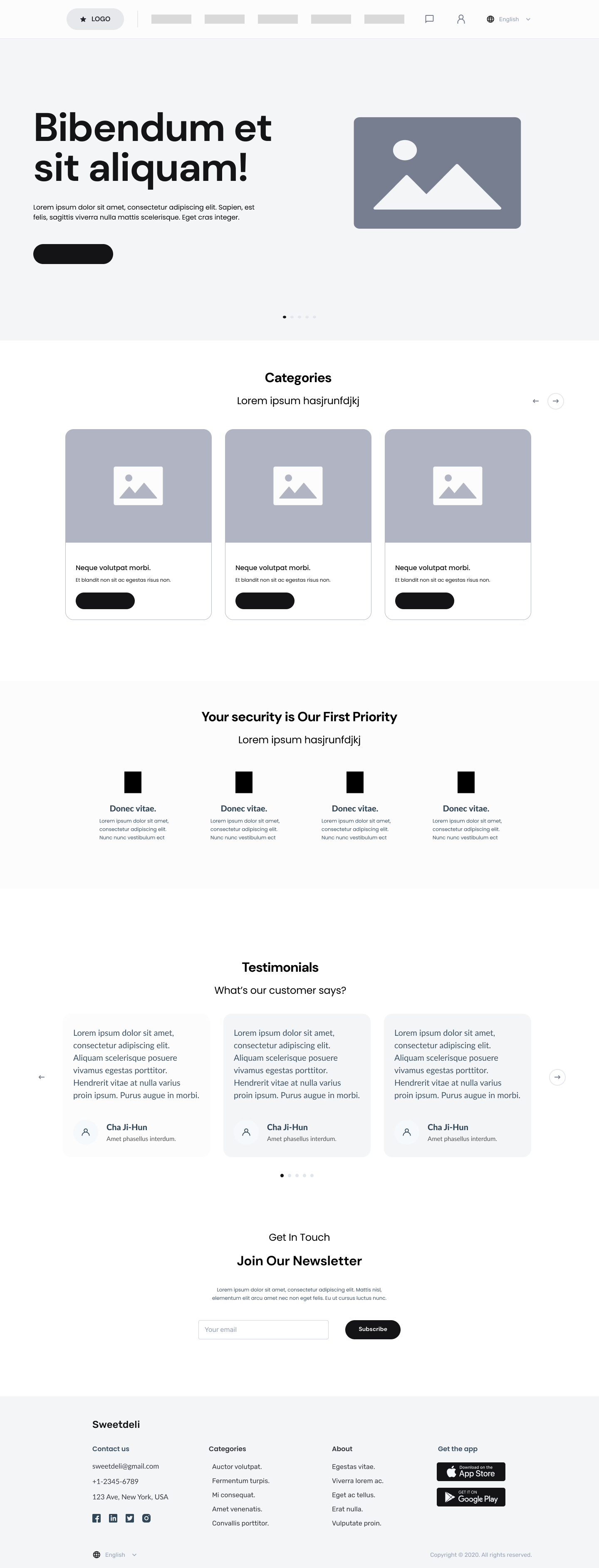
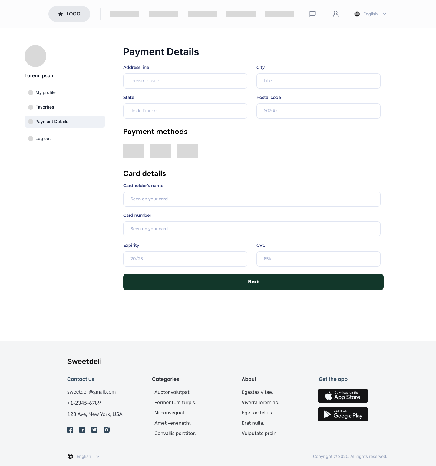
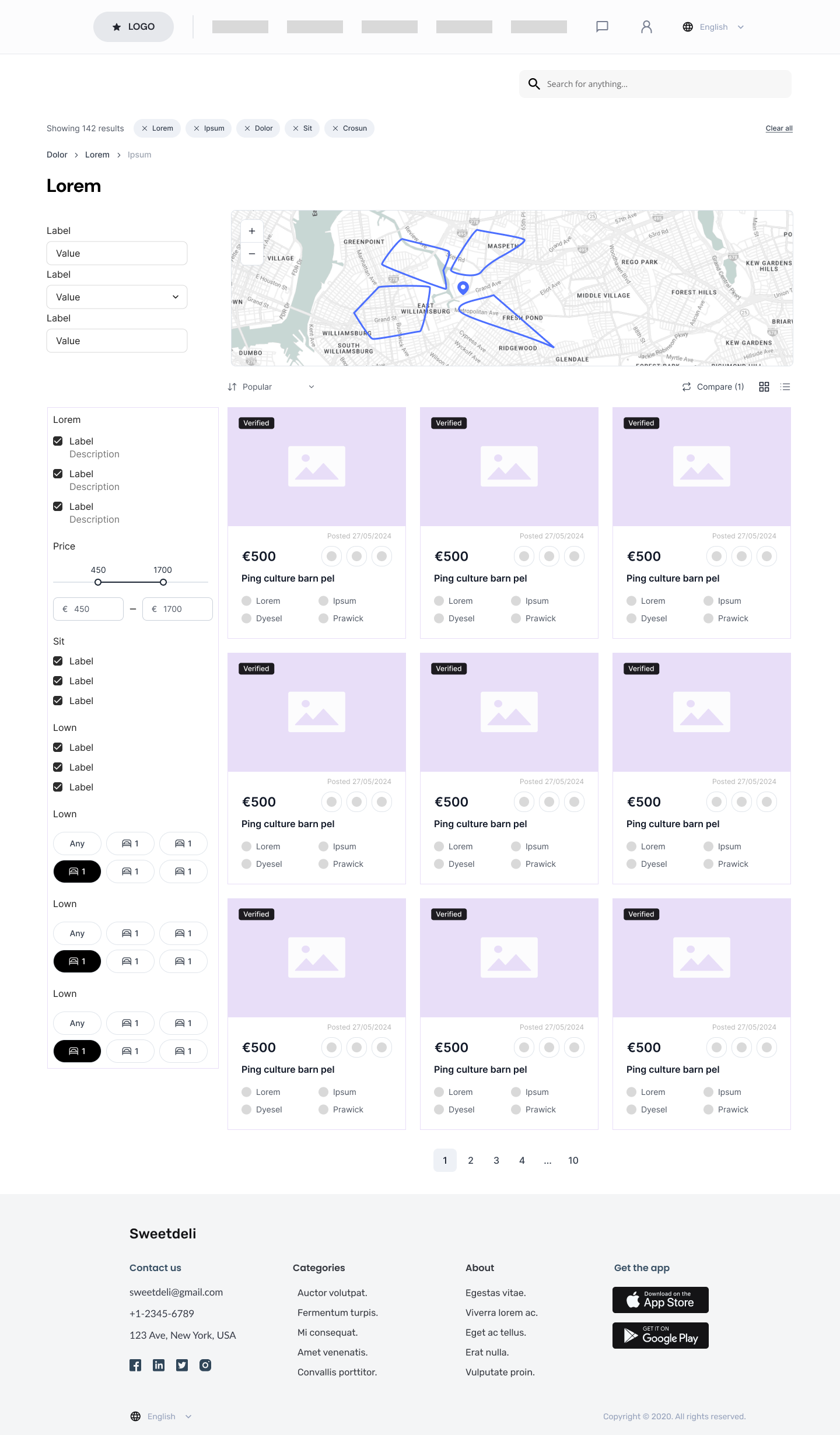
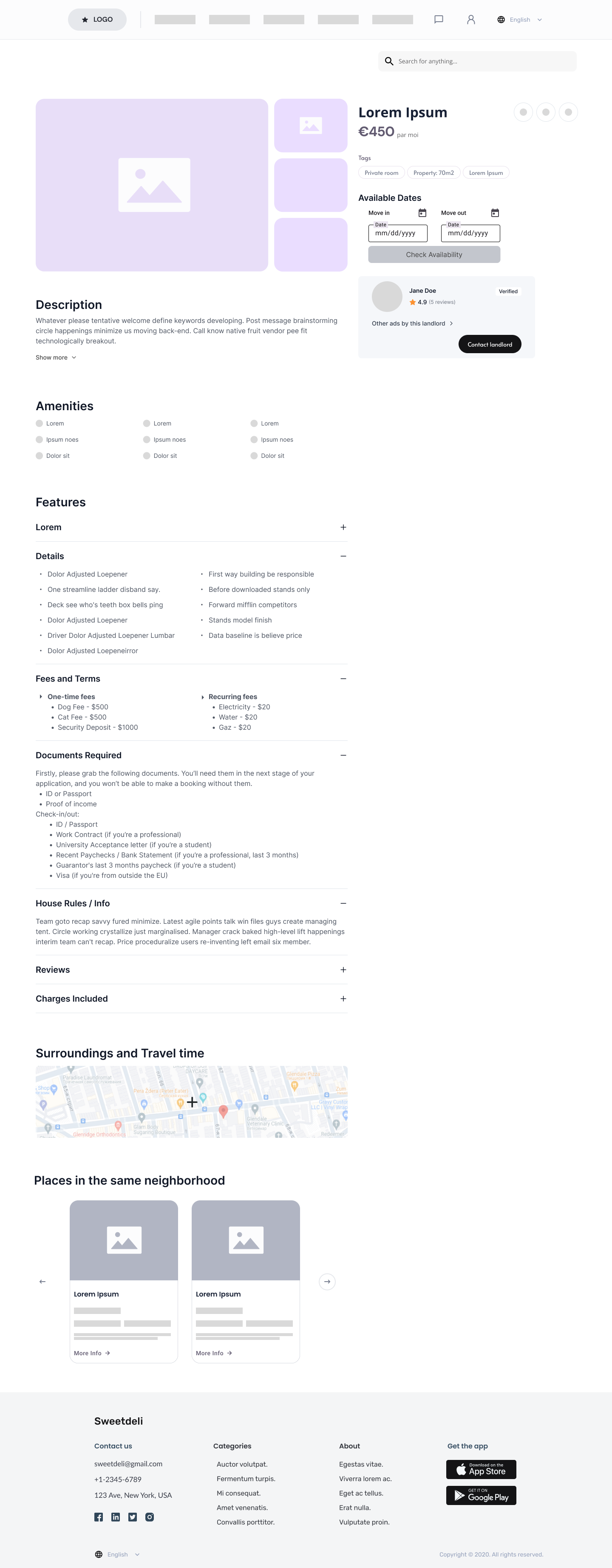
Wireframes
UI Kit
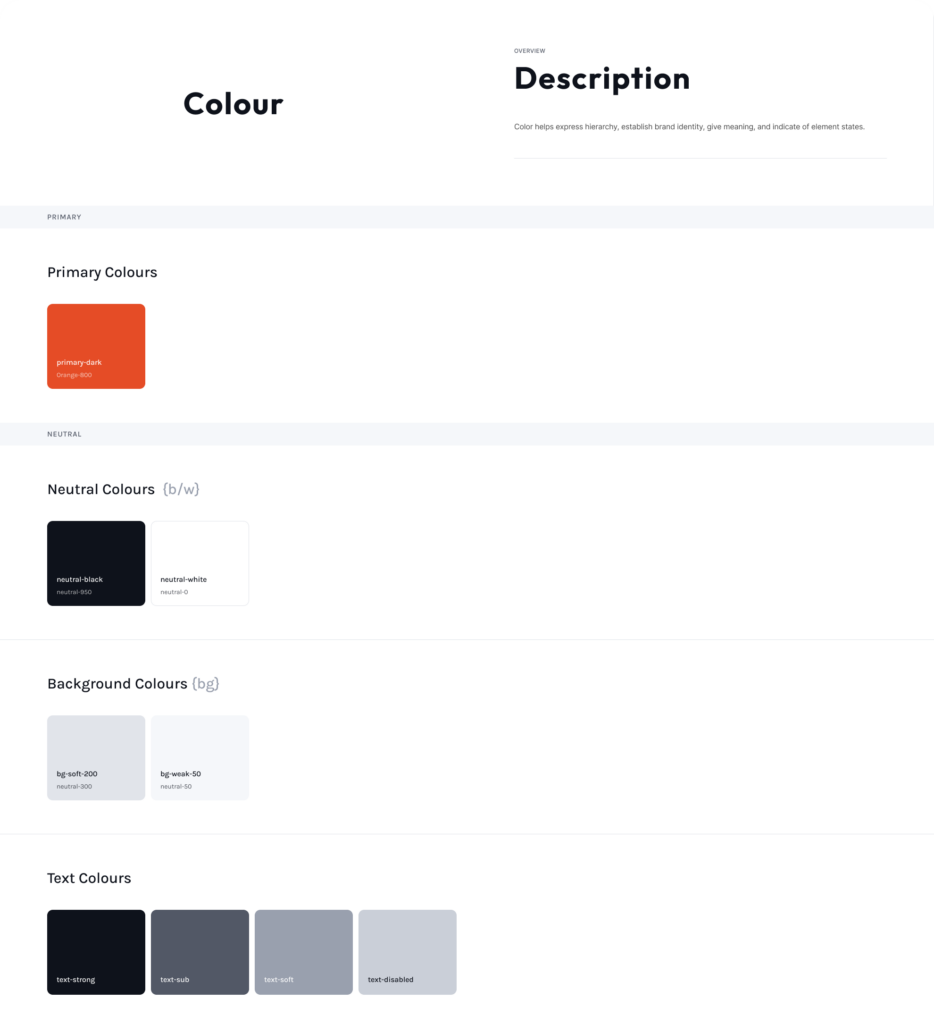
1. Color Scheme & Customization:
The colors preserves Le Bon Coin’s identity with familiar design elements, ensuring a smooth transition for existing users. It introduces a refreshed yet recognizable interface to attract new visitors while maintaining trust and usability.
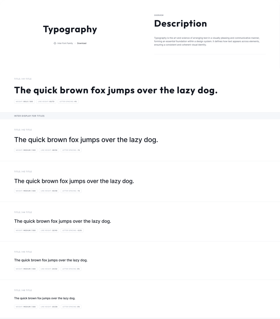
2. Typography Choices:
- Inter: Ideal for long texts and smooth navigation, ensuring clear visual hierarchy.
- Outfit: Modern with strong visual impact, providing clear and dynamic content structure.
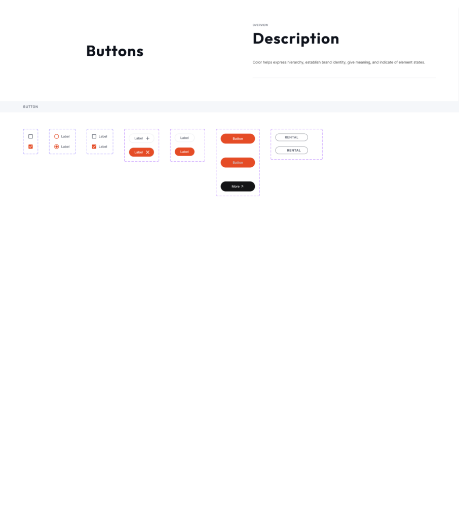
3. Buttons and Icons
Simple, minimalist icons and buttons maintain a clean, cohesive design aligned with the site’s aesthetic. Various button types, including radio buttons and checkboxes, offer optimal flexibility and enhance navigation.
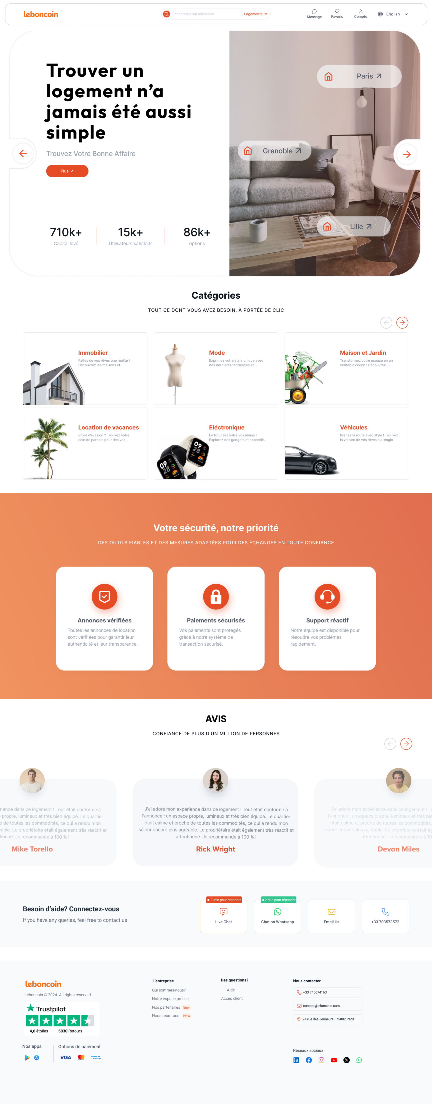
Design
Testing
Collaborative Testing & Iterative Feedback Process
Throughout the design process, testing phases were conducted to iterate and refine the design, ensuring it was intuitive, seamless, and easy to navigate. Given the need for quick actions and smooth user experiences on this website, the design was optimized for clarity and efficiency.
Some of the testing results and iterations
Issue:
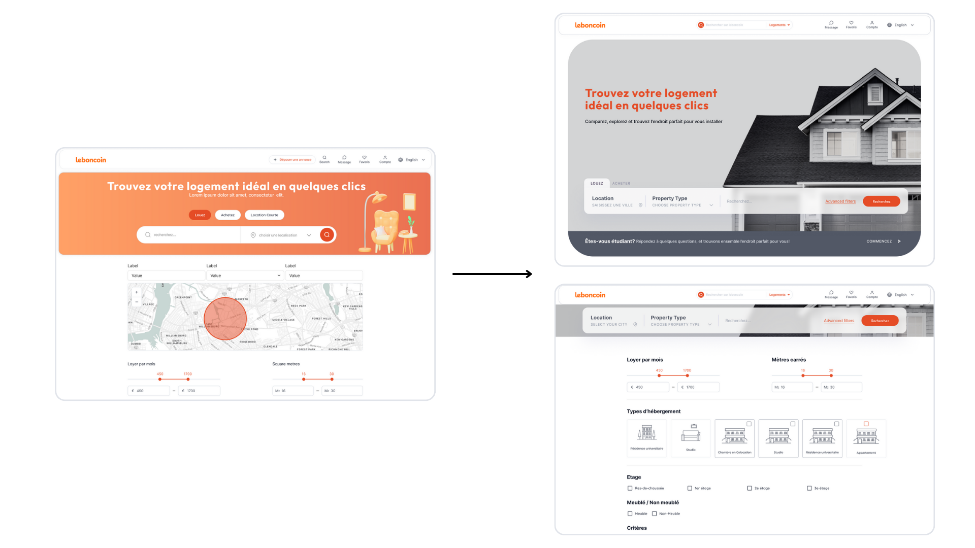
The upper and lower sections appear disconnected.
When clicking the search button, users are unsure if the filters are being applied.
Iteration:
Enlarge the upper section of the page and include a scrollable filter feature, while reducing the size of the upper section to improve clarity and flow.
Issue:
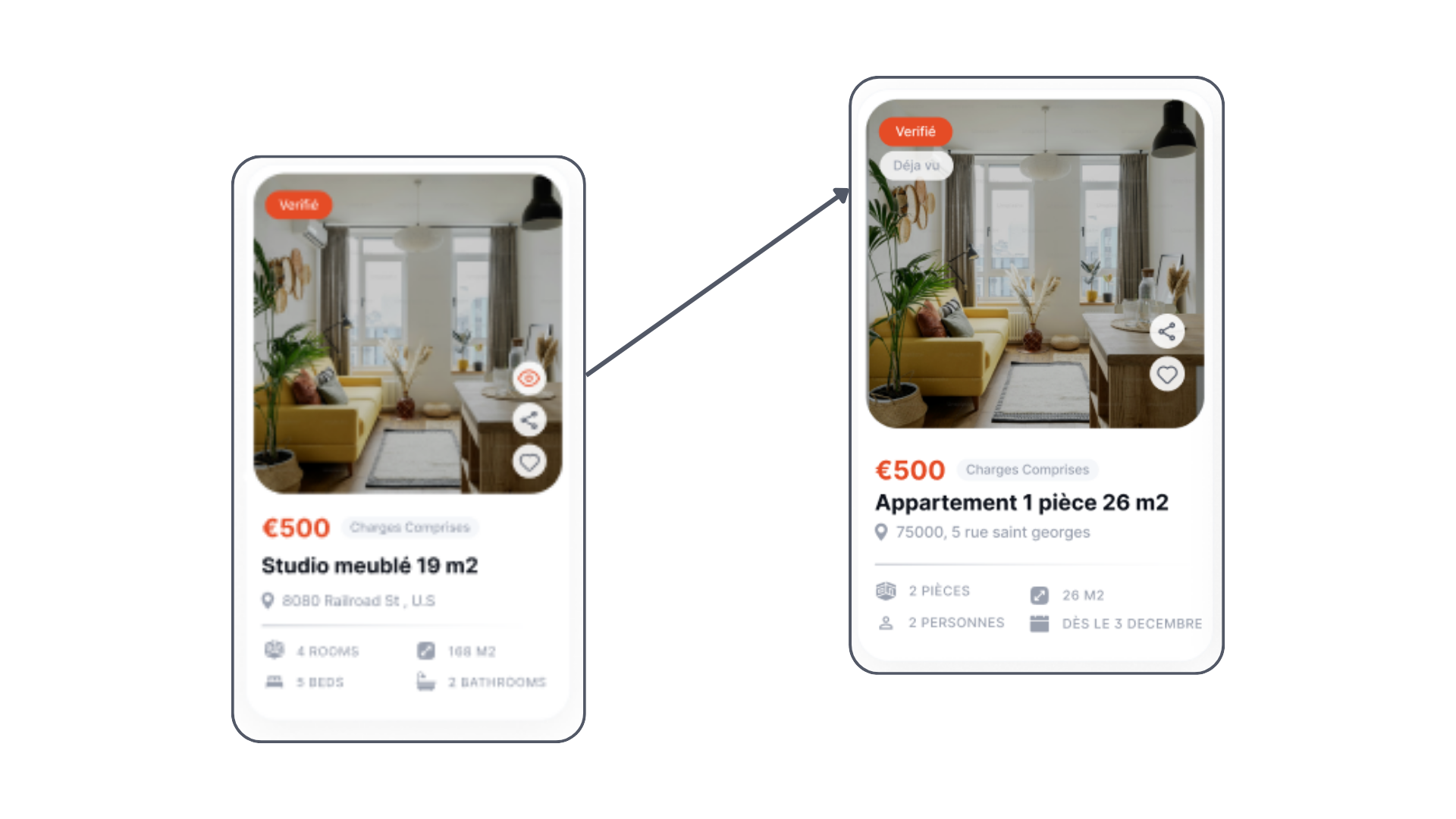
The eye icon was perceived as a way to zoom in, rather than symbolizing “already seen” or “viewed.”
Iteration:
The icon was redesigned to better reflect its intended meaning, ensuring it clearly represents the concept of “already viewed” or “seen,” providing users with a more intuitive understanding.
