- tatiana.a.barakat@gmail.com
Project Overview
This project involved the design and development of a mobile application tailored for event management. The solution focuses on scalability and customization, enabling clients to personalize their platforms while delivering a seamless user experience.
1
Needs
Client vision alignment
2
FLOW
User journey mapping
3
WIREFRAMEs
Initial design drafts
4
design
Customizable UI
5
TESTING
Usability adjustments
1. Needs
Vision
To establish Diggri as a unique platform that stands out for its exceptional design, features, and seamless user experience, empowering clients to create personalized event experiences.
Mission
Create an app that is easy to customize, offering remarkable design, intuitive usability, and seamless navigation, ensuring a smooth and engaging experience for both clients and users.

How might we design an event platform that allows seamless customization for each event, while providing a smooth and intuitive user experience for diverse audiences across different devices?

2. Flow
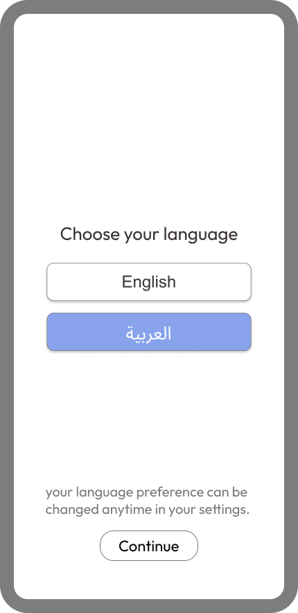
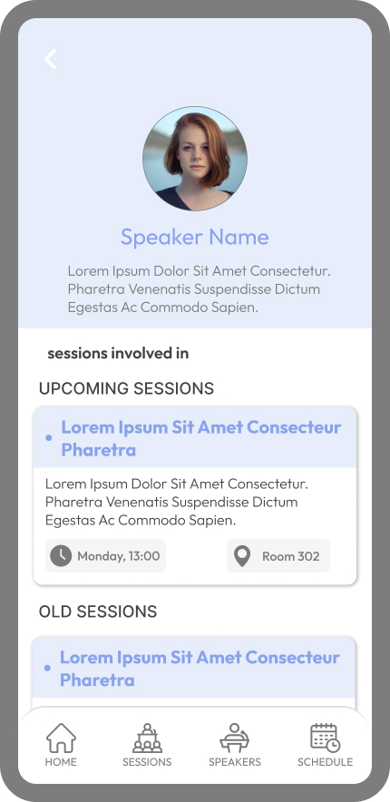
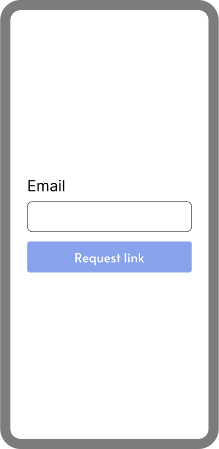
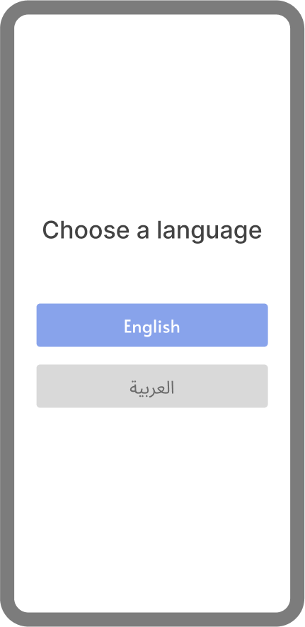
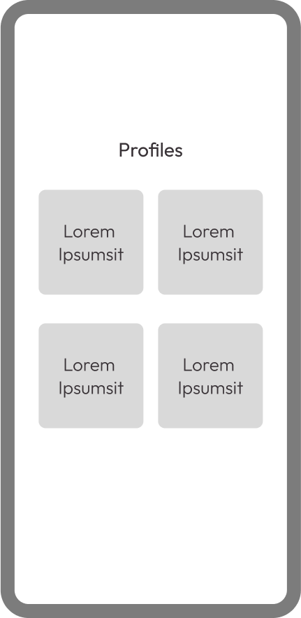
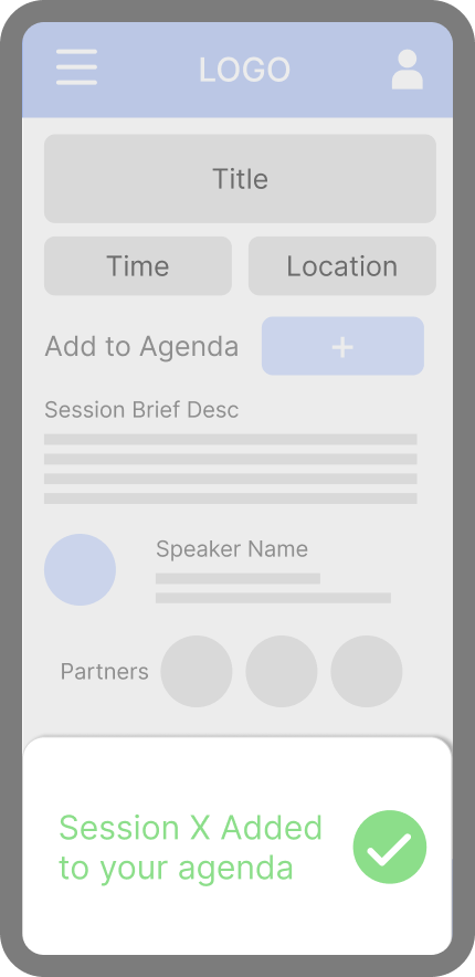
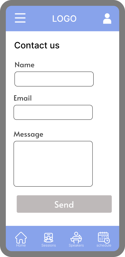
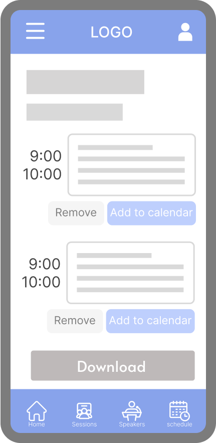
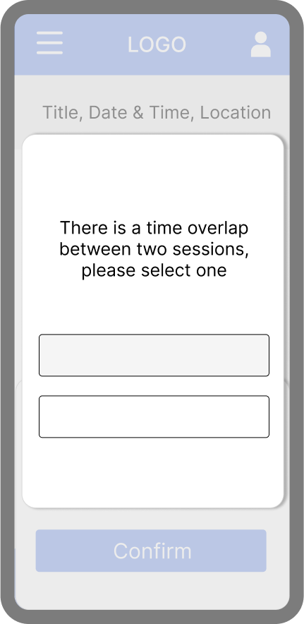
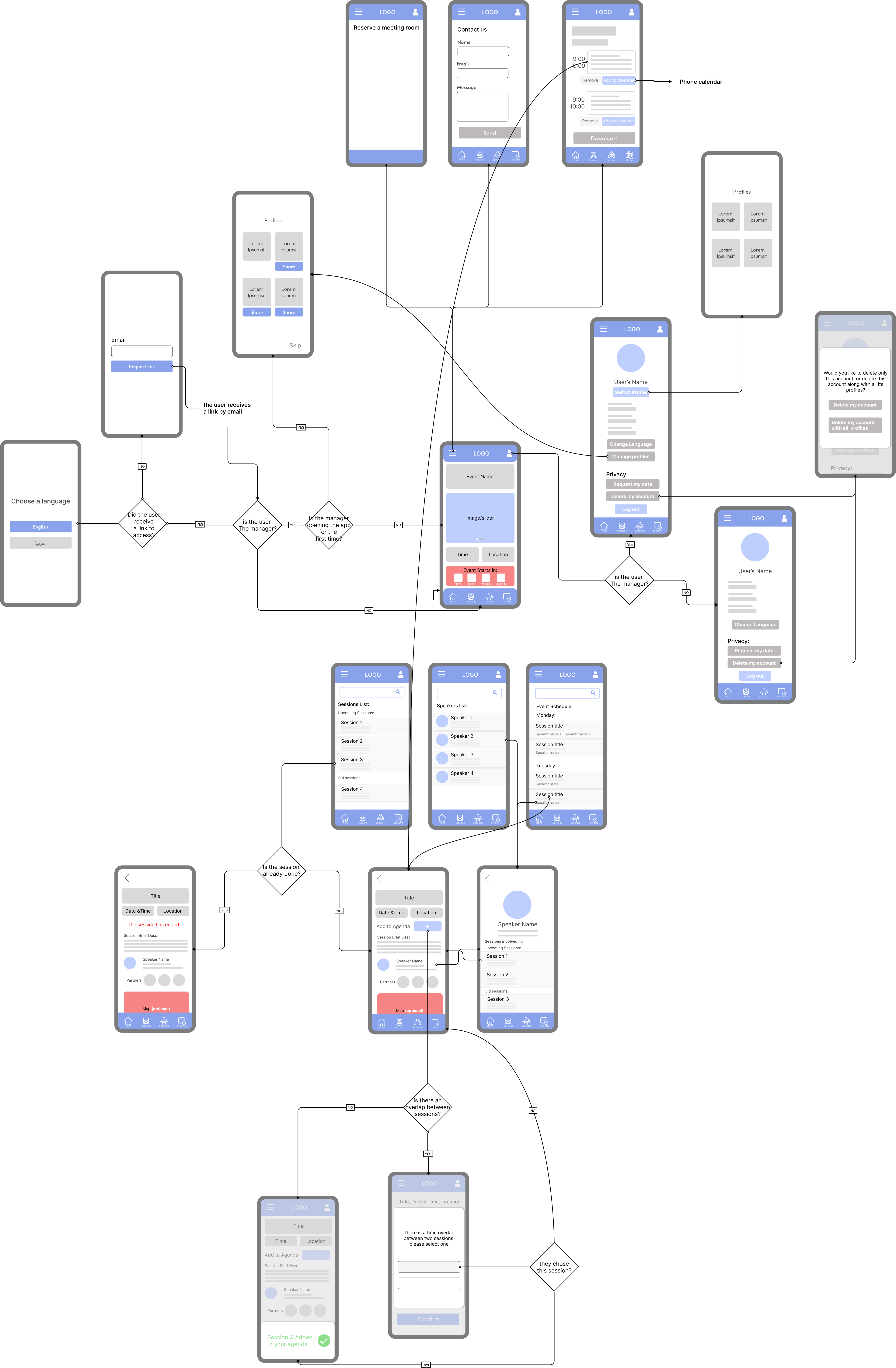
The necessary pages were identified and illustrated in a basic phone template. This approach ensured that the essential content for each page was included, providing clarity when presenting the navigation structure to the client. It offered a clear understanding for the client, project manager, and developers regarding the intended user journey within the application.
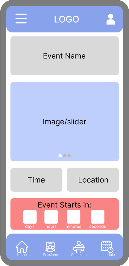
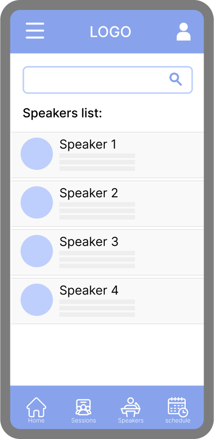
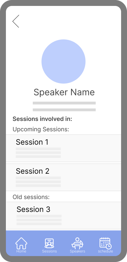
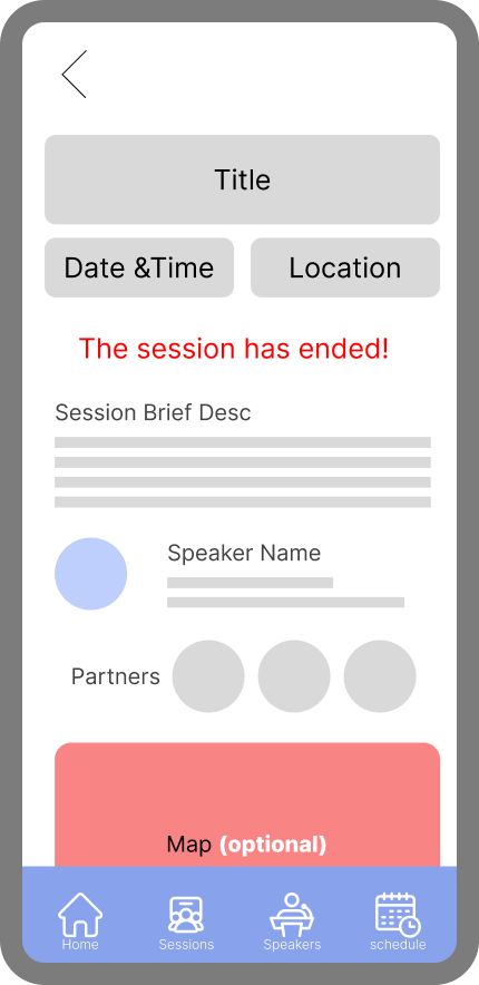
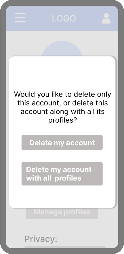
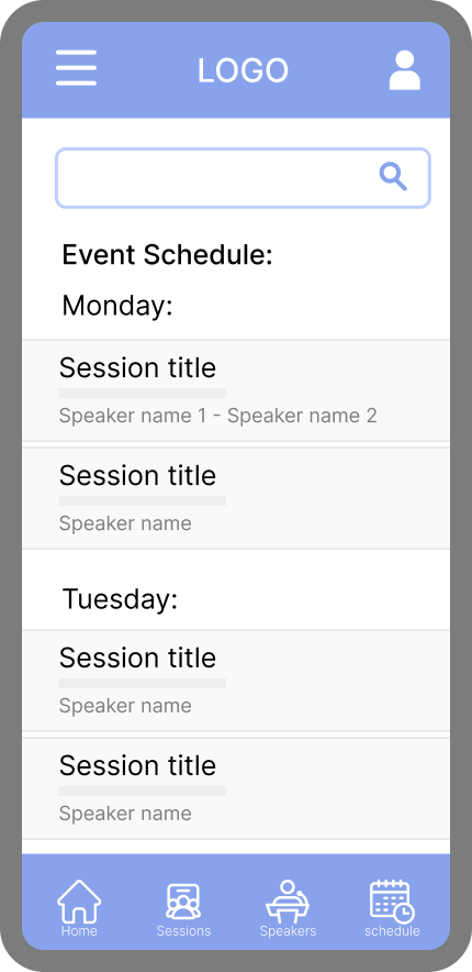
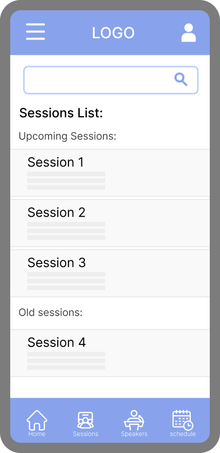
then,
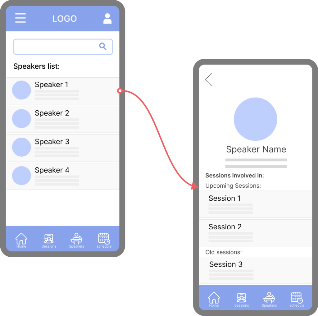
The pages were organized together to complete the user flow, clarifying the navigation structure and ensuring a cohesive experience. This process enabled a clear visualization of how users would interact with the app, ensuring seamless navigation.
3. Wireframes
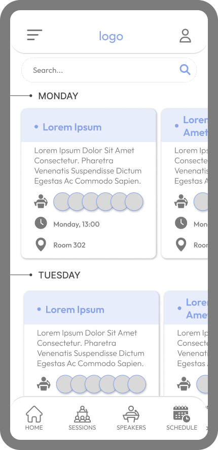
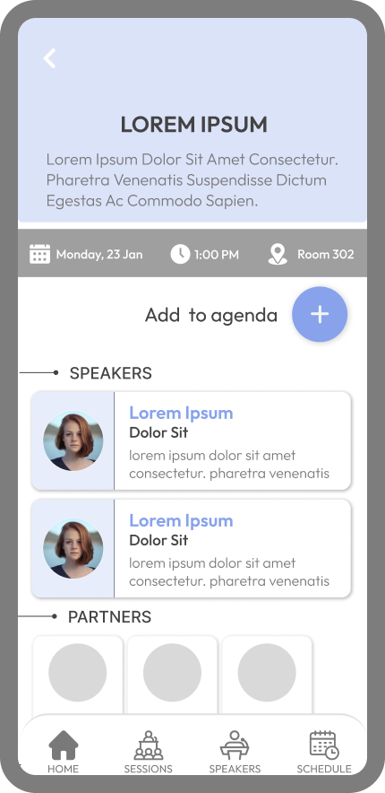
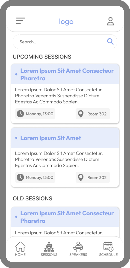
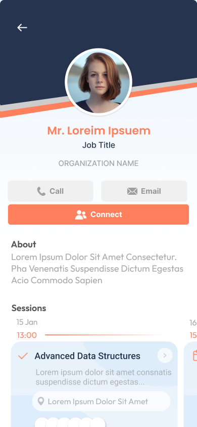
To establish a clear structure for the application, wireframes were created to outline the layout and functionality of key pages. By prioritizing essential features and simplifying the interface, these wireframes provided a solid foundation for discussions with stakeholders, ensuring alignment on both the visual direction and the functionality of the product.
4. Design
1. Color Scheme & Customization:
A cohesive look and feel for the app was established while allowing for customization by selecting a standard color palette.
The base color, #26344F, provides a professional foundation, complemented by #EBF3FB for balance. A pop color, #FF805D, was used for highlights and interactions, while a neutral light gray, #FCFCFC, harmonizes with all elements. This predefined palette enables clients to envision a unified, polished application that balances functionality with visual appeal.


2. Typography Choices:
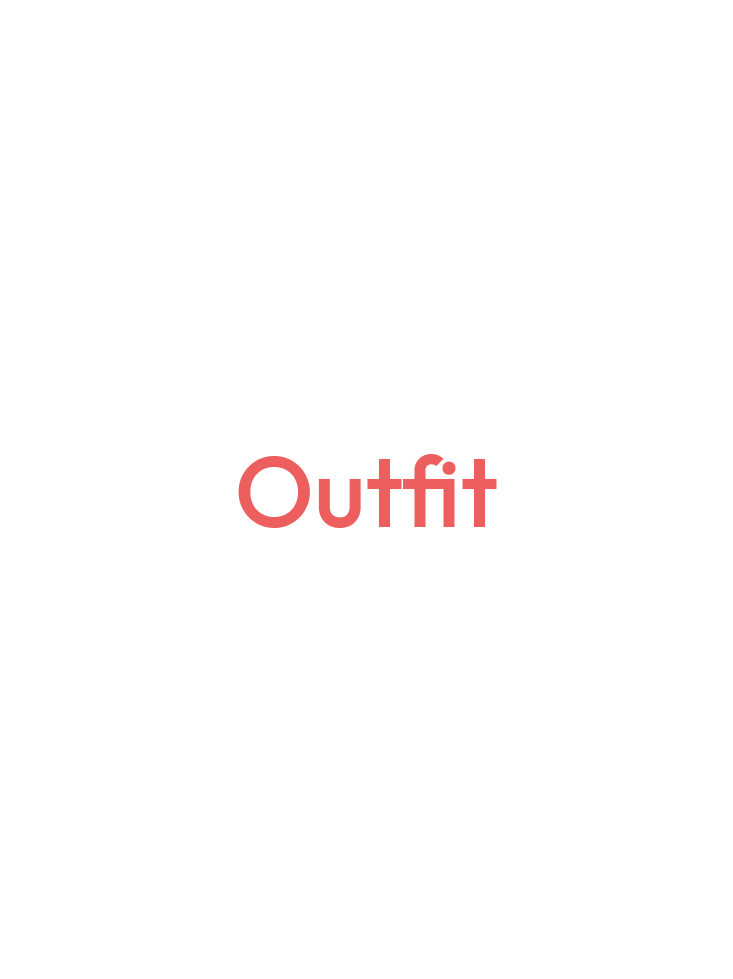
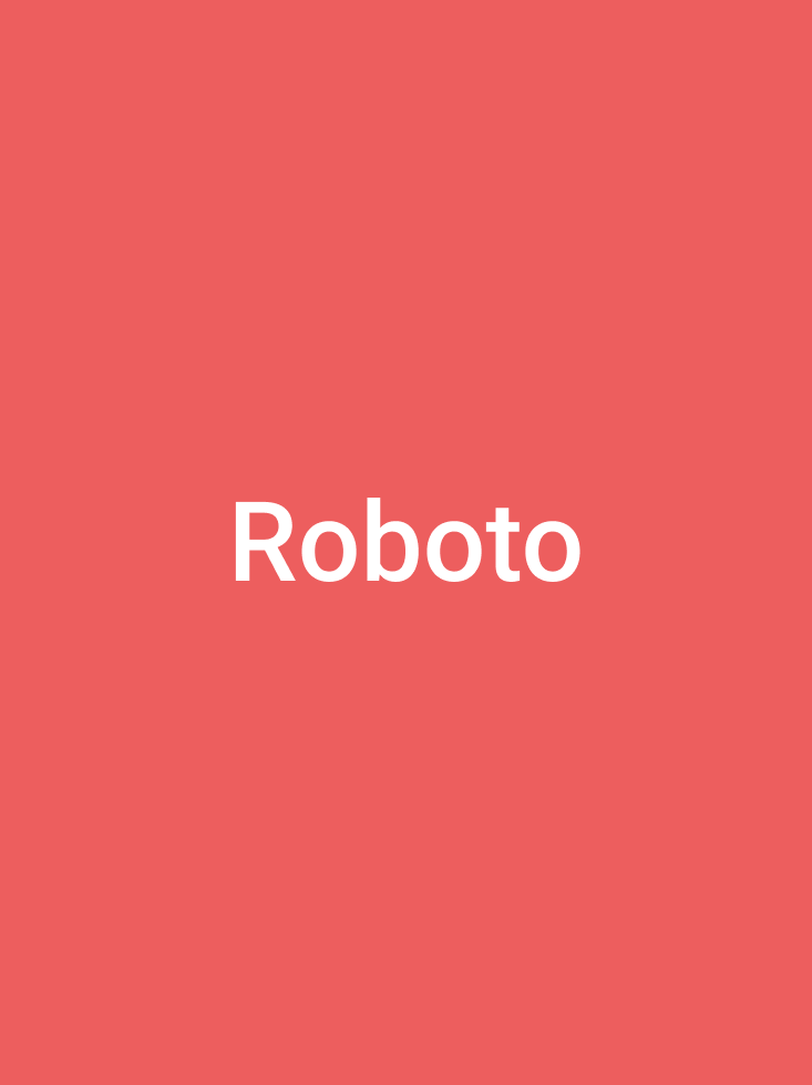
To support the app’s customization capabilities, a flexible typographic approach was adopted using two fonts: Roboto as the primary font for readability and Outfit to add visual interest.
3. Design Balance for Event Management:
The app’s design balanced simplicity with distinctiveness, ensuring a clean, intuitive layout while maintaining a visually unique appearance to differentiate it from competitors. This approach fosters a streamlined user experience, allowing users to focus on functionality while enjoying an appealing interface.
5. Testing
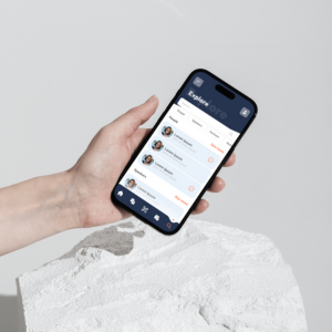
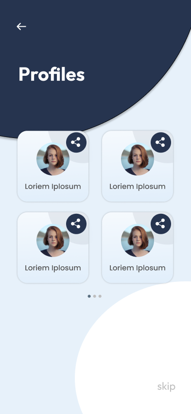
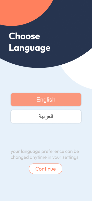
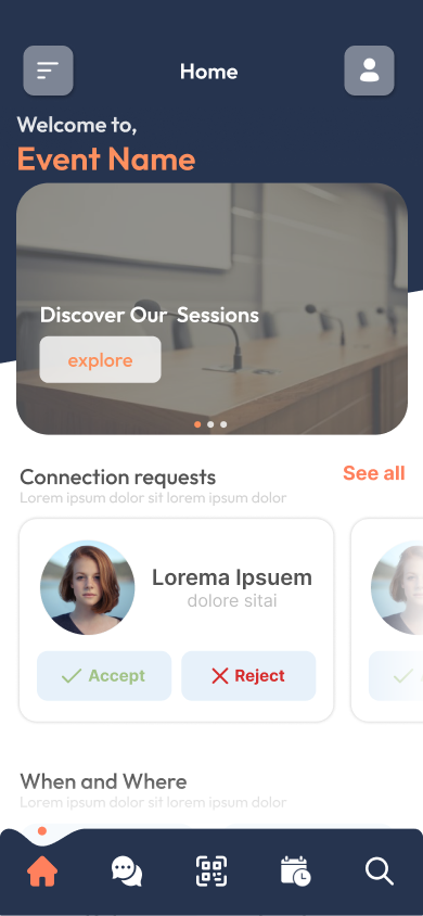
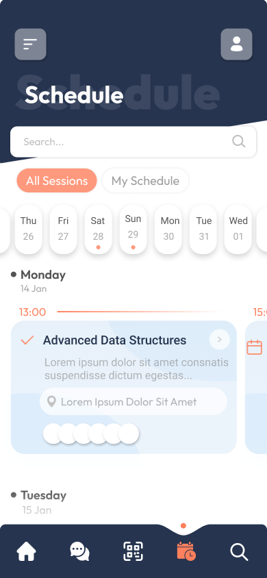
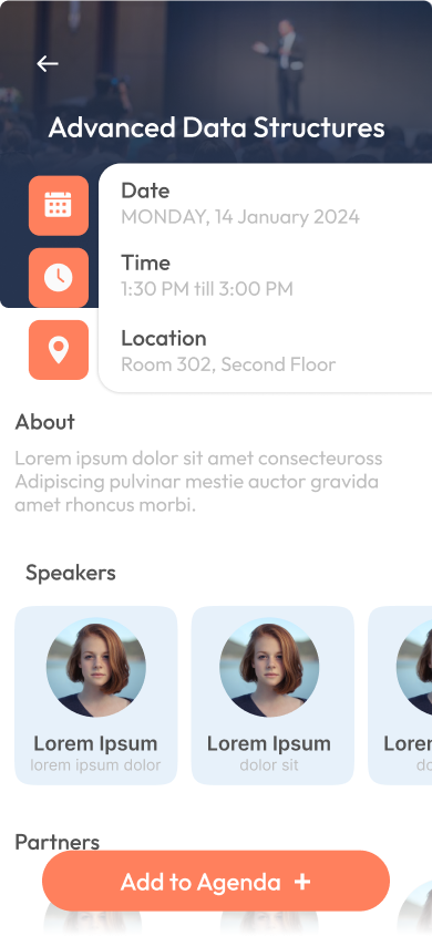
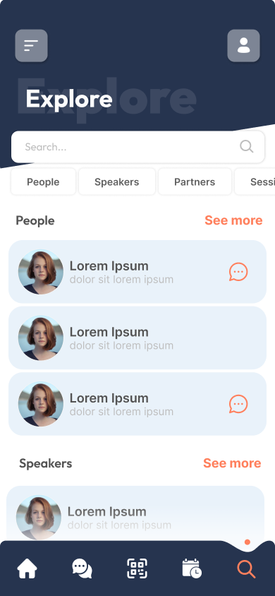
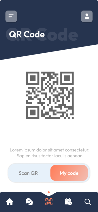
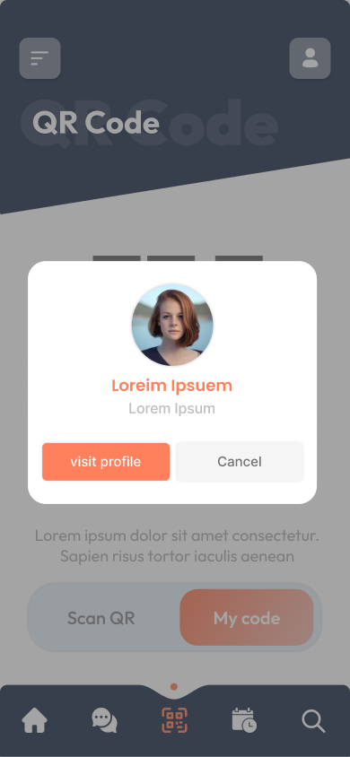
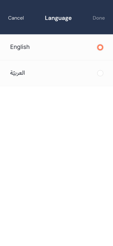
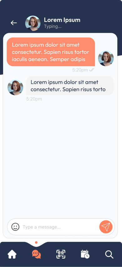
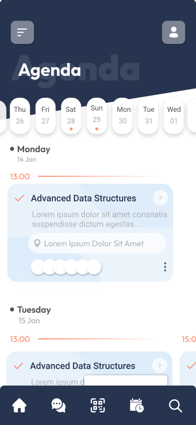
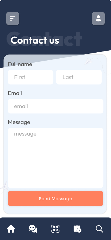
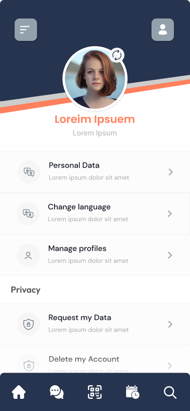
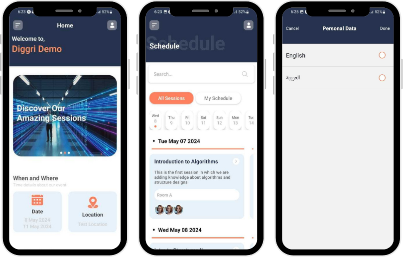
Early Screenshots of the Mobile Application
Collaborative Testing & Iterative Feedback Process
Detailed design reviews were conducted to ensure that visual elements translated accurately from prototypes to the live application. The development team provided APK files for testing on phones, allowing the app to be experienced as users would. Feedback was documented on GitHub using the ‘Issues’ feature to track functionality and design discrepancies. Through iterative testing cycles and close collaboration, issues were addressed early, ensuring a seamless and consistent user experience.

